Overview
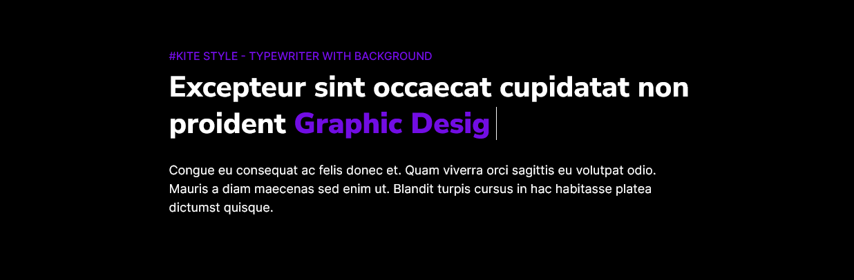
An "Animated heading" module is a component commonly used in web design and development to create dynamic and eye-catching headings or text elements on a website. These modules are typically implemented using a combination of HTML, CSS, and sometimes JavaScript to achieve various animations and effects.
Features Included
Here are some common features and effects that you might find in an animated heading module:
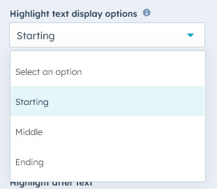
- Highlight Text Display Options: You can set the highlight text as per design. Such as "Start", "Middle" and "End".
- Text Animation: Animated headings often involve changing the appearance of the text itself. This can include transitions like fading in/out, sliding, scaling, rotating, or changing colors.
- Typing Effect: Some animated headings mimic the effect of typing out text, letter by letter, creating a sense of interactivity.
- Button: Optional functionality of the button is provided.
- Dynamic Content: Animated headings can be used to dynamically display content, such as news headlines or updates, with smooth transitions between them.
- Background Effects: Combining animated backgrounds with text can create visually stunning effects, such as moving gradients, images, or videos behind the heading.
-
Responsive Design: Ensuring that animated headings are responsive to different screen sizes and devices is crucial for a consistent user experience.
- Accessibility: Care should be taken to ensure that animated headings are accessible to all users, including those with disabilities, by providing alternative text or descriptions for screen readers.
The choice of animated heading features and techniques depends on the website's design, its target audience, and the message it wants to convey. When used effectively, animated headings can help make a website more engaging, improve user retention, and create a memorable browsing experience.
Module Setup
Setting up the Animated Heading Module is easy and straightforward. All you have to do is perform a simple drag and drop.
Now let’s go through the setup steps:
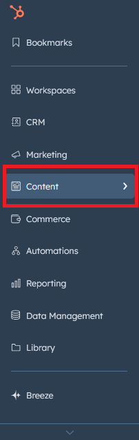
- Login to your HubSpot account and left side navigate to the “Content” tab.
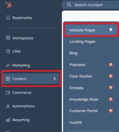
- Click on “Content” in the dropdown menu and select “Website Pages” from the extended menu.
- Under the module selection menu, search for “Animated heading” and select the module
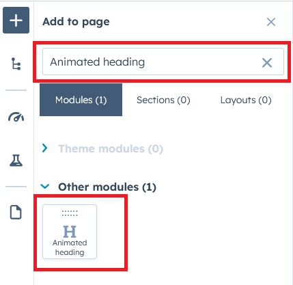
- Now simply pick the "Animated heading" module, drag, and drop it wherever you want on your page. You’ll see a new module appear on the page.
Content Setting
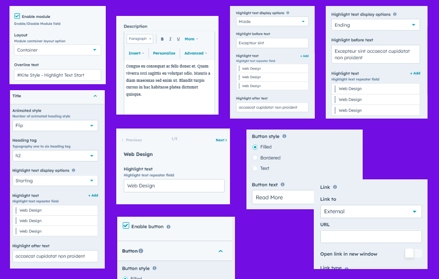
Under “Content”, you can edit the content you want to be displayed on your animated heading section. Easily adjust and update the “Enable Module”, “Layout”, "Overlay text", "Title", "Animated style", "Highlight Text Display Options", "Heading tag", "Highlight text",“Description” and "Button" as you please.
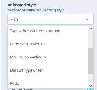
- Animation style: Animation style like "Fade", "Flip", "Typewriter with background color", "Fade with underline", "Moving on vertically", and "Default typewriter".
- Highlight Text Display Options: You can set the highlight text as per design. Such as "Start", "Middle" and "End"..
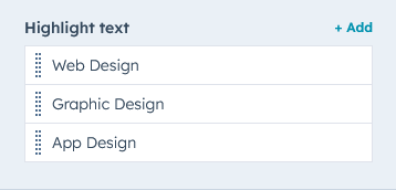
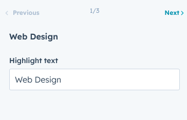
- Repeater field: Highlight text field is a repeater field. You can add as much as you want.
-
Figure 1: Repeater group
-
Figure 2: Repeater field open view
Style Setting
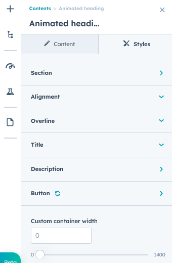
- Section: Under section spacing and background to manage module background solid color, background gradient and background image with overlay solid color and gradient. And spacing to easly manage desktop, tablet and mobile padding.
- Alignment: Alignment to easly manage heading "Left", "Right" and "center"
- Overline: Easy customize the overline text typography font, color, line height, text transform and font weight
- Main title: Easy customize main title text typography font, color, line height, text transform and font weight. And also manage Highlight color
- Description: Manage the description color and line height
- Button: Button style such as "Font size", "Font weight", "Text transform", "Letter spacing", "Color", "Border", "Background solid color", "Background gradient color", "Hover solid and gradient color", and "Hover border color" so on.
- Container: Container width to manage, customize the custom container width.
Support
If you have further questions, please reach out to our team at hawksky3012@gmail.com.