Overview
The "Call to Action (CTA)" module is designed to drive user engagement by encouraging specific actions, such as subscribe, signing up, making a purchase, downloading content, social media marketing, or navigating to key pages. It typically features compelling copy, strong visual design, and a clearly defined button or link to guide users toward the desired outcome. This module can be customized to align with campaign goals, target audiences, and brand messaging, and is strategically placed throughout digital experiences to optimize conversion rates.
Features Included
Here are key features and effects that you might find in a "Call to Action (CTA)" module:
- 7+ Unique Styles: Choose from 7+ unique styles to match your vibe — switch anytime, no limits.
- Customizable Content: Easily edit headlines, subtext, and descriptions to match your campaign goals or user journey.
- Flexible Layouts: Choose from inline, full-width, left side content and right side get in touch (Button, Form and Social Media) formats to match your page design and user flow.
- Actionable Buttons: Add one or more buttons with custom labels, styles, and destinations (e.g. link).
- Get in Touch (Form and Social Media) Support: You can use the form in the module to use functionalities like subscribe and signing up. And social media are repeater items, you can use any social media. Elements like (forms and social media) support unlimited style customization.
- Interactive Demos: Allow users to explore Call to Action (CTA) through interactive demos. [Click here to view the demo.]
- Design Control: Customize background colors, gradient color, images, fonts, spacing, animation and alignment to stay on brand.
- Smooth Animations: Attracts the user's attention, improves the intuitiveness of the user interface, and contributes to a modern and attractive design.
- Responsive & Mobile-Optimized: Ensures a seamless and accessible user journey, accommodating users on different devices without compromising functionality or design. And Optimized for mobile, tablet, and desktop for consistent user experience across devices.
The Call to Action (CTA) module is a versatile and practical UI element for improving the organization and presentation of content on websites.
Module Setup
Setting up the "Call to Action (CTA)" Module is easy and straightforward. All you have to do is perform a simple drag and drop.
Now let’s go through the setup steps:
- Login to your HubSpot account and left side navigate to the “Content” tab.

- Click on “Content” in the dropdown menu and select “Website Pages” from the extended menu.

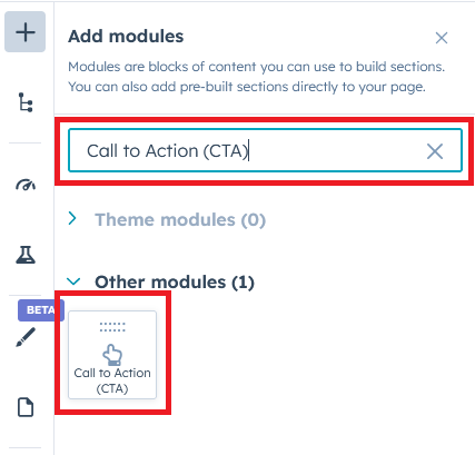
- Under the module selection menu, search for “Call to Action (CTA)” and select the module
- Now simply pick the "Call to Action (CTA)" module, drag, and drop it wherever you want on your page. You’ll see a new module appear on the page.
#Kite: 1. Heading + Description with Buttons

#Kite: 2. Heading + Description with Subscribe form

#Kite: 3. Heading + Description with Social Media

#Kite: 4. Leftside Content and Rightside Button
 #Kite: 5. Righside Content and Leftside Button
 #Kite: 6. Subscribe Form

#Kite: 7. Social media

Content Setting
Under “Content”, you can edit the content you want to be displayed on your Call to Action (CTA) section. Easily adjust and update the “Call to action types”, "Overline text", "Heading text", "Get to be in touch - Options (Button, Form and Social Media)", "Button (Repeater items)", "Additional note text", "Advanced setting", "Module JS" and more as you please.
Below is an overview listing of module content settings:
- Call to action types: This module includes 7+ unique styles that make your page attractive. You can use style as per your design and requirement.

- Overline text: This is an optional field. You can use this field to include keywords to make the section more interesting.
- Heading text: This is a rich text box field. It is used to customize the content (Heading text and Description) according to your design and requirements.
- Get to be in touch - Options: This is a choice field (like buttons, social media, and subscribe forms). You can use it according to your design and needs.

- Button: This is a repeater group. You can use the multiple type (like Filled, Bordered and Text) button.


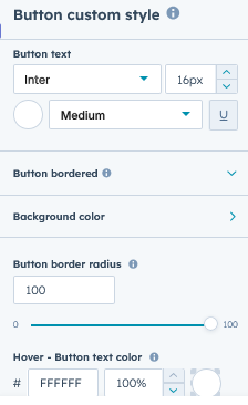
- Button custom style: You can customize the button style as per the design and requirement. This is an inline button customization style.

- Button custom style: You can customize the button style as per the design and requirement. This is an inline button customization style.
- Subscribe form: This is a form field. You can use the form to do things like sign up, subscribe etc.

- Social media: This is an element for creating contact. Like social media. This is a repeater item.

- Button: This is a repeater group. You can use the multiple type (like Filled, Bordered and Text) button.
- Additional note text: This is a text field. This is an optional field. You can use the additional text to describe your product or brand.

- Advanced setting: This group includes "Section ID", "Section Class", "Block Content Alignment", and "Animation". You can use advanced settings according to your design and needs.

- Module JS: Include the module level jQuery show/hide field.
Style Setting

- Section: Under section spacing, border radius and background to manage module background solid color, background gradient and background image with overlay solid color and gradient. And spacing to easily manage desktop, tablet and mobile padding.

- Overline text: Easy customize the overline text typography font, color, line height, text transform letter spacing, font weight, and You can manage spacing on desktop, tablet, and mobile.
- Description bottom spacing: You can manage the spacing at the bottom of the description using this field.
- Button: You can customize the common style of the button group.
- Subscribe form: You can customize the style of the form elements within this group.
- Social media: You can customize the style of the social media within this group. Such as background color (Solid and Gradient), Icon color, Border color, Border radius, Icon size, Hover icon color, Hover circle background color etc.. So on
- Additional text: You can easily customize the style of additional text. Such as "Text Font Size", "Font Weight", "Text Color", "Font Family" and "Spacing" etc.
- Container custom size: Container width to customize the custom container width.

Support
If you have further questions, please reach out to our team at hawksky3012@gmail.com.