Overview
A "CounterMaster Pro" module can be designed to handle various counting tasks within a project. This module could provide features like animated incrementing counts. It also includes more functionality for multiple counters, counts on page scroll, without counts on page scroll, with hover, without hover, blurred background, transition and animation etc. It's easy, mobile-friendly, and adds a touch of trust. The special thing about this module is that you can set it according to your design and requirements.
Features Included
Here are key features and effects that you might find in a "CounterMaster Pro" module:
- Counter Management: Counts/Without counts animation effect on page scroll.
- Labeling and Categorization: Assign labels or symbol to counters for easy organization. Group counters under different projects or categories.
- Multiple Style: Multiple style options are provided to CounterMaster Pro in this module. Such as "With hover", "Without hover", "Grid layouts", "Blurry box bacgkround", "Bordered", "Transition effect box", "Counts/Without counts animation effect on page scroll", "With/Without description" and "With/Without Icon" etc.
- Interactive Demos: Allow users to interact with the CounterMaster Pro through interactive demos. Click here view demo
- Smooth Transitions and Animations: Implementation of visually appealing transitions and animations to provide a polished and modern user experience.
- Design and Customization: Endless customization possibilities for design, allowing users to tailor the interface to their preferences without constraints. Offers flexibility to customize according to the specific needs and requirements of the project or workflow.
- Cross-Browser Compatibility: Test and ensure compatibility with major browsers to provide a consistent experience. Consider using browser prefixes or polyfills for CSS features if needed.
- Responsive Design: Ensure that the CounterMaster Pro module is responsive and compatible with various devices and screen sizes, including desktops, laptops, tablets, and smartphones.
This module tailored or expanded based on the specific needs of the project or the target audience.
Module Setup
Setting up the "CounterMaster Pro" Module is easy and straightforward. All you have to do is perform a simple drag and drop.
Now let’s go through the setup steps:
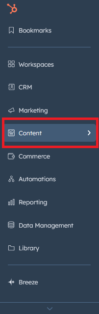
- Login to your HubSpot account and left side navigate to the “Content” tab.
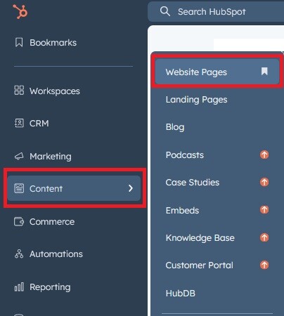
- Click on “Content” in the dropdown menu and select “Website Pages” from the extended menu.
- Under the module selection menu, search for “CounterMaster Pro” and select the module
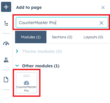
- Now simply pick the "CounterMaster Pro" module, drag, and drop it wherever you want on your page. You’ll see a new module appear on the page.
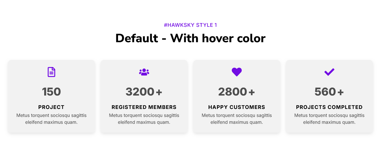
Figure: Drag and Drop View
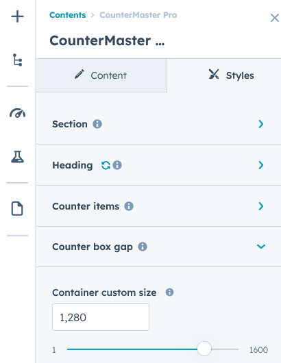
Content Setting
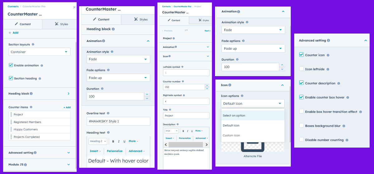
Under “Content”, you can edit the content you want to be easily adjust and update the “Section layout”, "Enable heading", "Enable animation", "Repeater counter items", "Animation", "Counter icon (Show/hide)", "Number counts (Counts on page scroll and disable counts on page scroll)", "Counters title", "Counters description", "Advanced setting" and more as you please.
Below is an overview listing of module content settings:
- Section layout: Section layouts can be set across module levels. Such as "Container" and "Full width".
- Enable animation: Animation of Heading and Repeater Counters items can be shown/hidden using "Enable animation" field.

- Enable heading: Show/hide section heading.
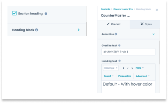
- Animation: This group includes a field to animate headings. Like "Fade", "Flip" and "Zoom".
- Overline text: You can use this field as a section highlight keyword.
- Heading text: This field as a section heading text.
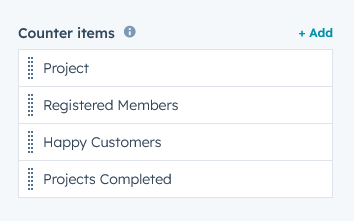
- Counter items: This is a repeater group. You can add/remove/delete counter items as per your wish. You can add as many as you want.
- Animation: This group includes a field to animate counter items. Like "Fade", "Flip" and "Zoom".
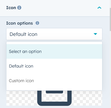
- Icon: The icon group will appear when you enable it from advanced settings. "Default" and "Custom" icons can be used based on your design and requirement.
- Leftside Symbol: Using this field, you can add/update/delete a symbol to the left of the number counter. For example $
- Counter number: You can use it to present any analytics. This is Compulsory Field.
- Rightside Symbol: Using this field, you can add/update/delete a symbol to the right of the number counter. For example K, +, % and K+
- Counts title: This field is used for any analysis title.
- Counts description This field is used for any analysis description.
- Advanced setting: You can customize the module as per your design and requirement using advanced settings.
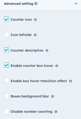
- Counter icon: Using this field, you can show/hide the counter icon itself.
- Icon leftside: Using this field, you can change this counter icon position top to left side.
- Counter description: Using this field, you can show/hide counter description.
- Enable counter box hover: Using this field, you can set the box hover color and hover border color.
- Enable box hover transition effect: Using this field, you can set the smooth top effect on box hover.
- Box background blur: You can also keep the background of the box in a blurred style. But when you set the Blurry, you have to set the opacity of the background color. And the section background image has to be used.
- Disable number counting: Using this field, you can disable the numbers count effects on page scroll.
- Module JS: Includes the module level jQuery CDN show/hide field. If you don't need it, you can disable this field.
Style Setting
- Section: Under section spacing and background to manage module background solid color, background gradient and background image with overlay solid color and gradient. And spacing to easily manage desktop, tablet and mobile padding.

- Heading: Easy customize the overline text typography font, color, line height, text transform and font weight and Heading alignment and spacing.
- Counter items: this group includes the style of counter box. Such style as "Icon", "Counter number", "Counter title", "Counter description", "Background color", "Spacing", "Border", "Border radius", "Box Shadow", "alignment", and "Hover style".
- Icon: Using this group, you can customize the counter "Icon size", "Icon color", and "Icon bottom margin".
- Counter number: Using this group, you can customize the counter number style. Like "Font size (Desktop, Tablet and Mobile)", "Color", "Font family", "Font weight".
- Counter title: Using this group, you can customize the counter title style. Like "Font size", "Color", "Font family", "Font Weight", "Text Transform" and "Margin top".
- Counter description: Using this group, you can customize the counter description style. Like "Font size", "Color", "Font family" and "Font Weight".
- Background color: Using this group, you can customize the counter box background color style. Like "Background solid color", "Background gradient color" and "None". And if Enable the Box background blur options, then you have to set the opacity of the background color. And the section background image has to be used.
- Spacing: Using this group, you can customize the padding inside the box as desired. You can manage styles on desktop, tablet and even mobile.
- Border: Using this field, you can customize the border of the box as per the design or requirements.
- Border radius: Using this field, you can customize the border radius of the box as per the design or requirements.
- Alignment: Using this field, you can customize the content alignment (left, right and center) of the box according to the design or requirements.
- Box shadow: Using this field, you can customize the box shadow of the box as per the design or requirements. And also optional functionality.
- Hover - Counter box: This is an optional group. If you enable it in advanced settings, this group will be shown. Using this group, you can customize the "Icon color", "Box background color (Solid, Gradient and None)", "Counts number color", "Counts title text color", and "Counts description text color".
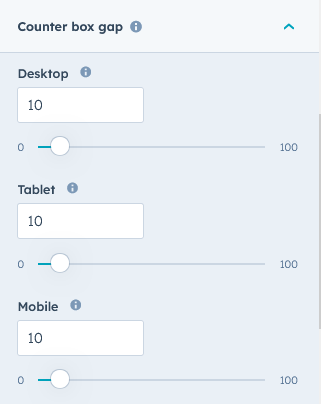
- Counter box gap: Using this group, you can customize box gap (desktop, tablet and mobile) according to your design or needs.
- Container custom size: Using this field, you can customize the container width.
Support
If you have further questions, please reach out to our team at hawksky3012@gmail.com.