
Overview
The "Event Schedule" Module enables organizers to create, manage, and display event agendas efficiently. It allows users to schedule sessions, workshops, keynote speeches, and networking activities with specific dates, times, locations, and speakers. Attendees can easily view the complete event timeline, track session details, and stay updated on any schedule changes. The module helps ensure a well-organized event experience by providing a clear, structured, and accessible schedule for all participants.
Features Included
Here are some key features and effects that you might find in a portfolio with "Event Schedule" module:
- Session Management: Create, organize, and manage all event sessions from a centralized dashboard. Easily update session details, timings, and agendas whenever needed.
- Speaker Assignment : Assign speakers to specific sessions and showcase their profiles. Helps attendees identify presenters and learn about their expertise.
- Date & Time Scheduling: Schedule sessions with accurate dates, start times, and end times. Ensures smooth event planning and avoids timing conflicts.
- Venue Management: Allocate venues, halls, or meeting rooms for each session. Makes it easy for attendees to locate and attend their desired events.
- Multi-Day Event Support: Manage events that span across multiple days from a single platform. Keeps schedules organized and easy to navigate for attendees.
- Interactive Demos: Allow users to explore Event Schedule through interactive demos. [Click here to view the demo.]
- Session Details Page: Provide comprehensive information about each session in one place. Includes descriptions, speaker details, timing, and venue information.
- Mobile-Friendly Access: Provide seamless access to schedules across smartphones, tablets, and desktops.
Ensures attendees can view event information anytime, anywhere. - Customization Options: Users may have the option to customize the appearance of the event schedule, such as tabs button alignment, tab button text alignment, and tab button adjusting typography, color, background color, border and so on.
- Animation/Transition: Animations and transitions can be applied to the heading, event session, providing a visually engaging and polished user experience.
-
Accessibility: It's important to ensure that Event Schedule modules are designed with accessibility in mind.
By combining these key Event Schedule features, organizers can create a well-structured and engaging event experience. Attendees can easily explore sessions, track schedules, and receive real-time updates. The module improves event coordination, enhances participant engagement, and reduces scheduling complexities. This results in a seamless, organized, and successful event for everyone involved.
Setting up the "Event Schedule" Module is easy and straightforward. All you have to do is perform a simple drag and drop.
Now let’s go through the setup steps:
- Login to your HubSpot account and left side navigate to the “Content” tab.
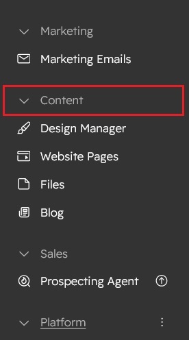
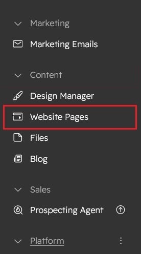
- Click on “Content” in the dropdown menu and select “Website Pages” from the extended menu.
- Under the module selection menu, search for “Event Schedule” and select the module
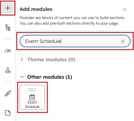
- Now simply pick the "Event Schedule" module, drag, and drop it wherever you want on your page. You’ll see a new module appear on the page.

Content Setting

- Under content include the field "Enable module", "Layout", "Enable heading", "Heading Group", "Portfolio Group" and "Module js Group"
- Enable module: Show/hide module using "Enable module" field
- Layout: Manage the section layout like "Container" and "Full width"
- Enable heading: Show/hide heading group
- Heading:
- Enable animation: Show/hide section heading animation
- Animation: Animation dropdown include the "Animation style" choice field, "Fade options" choice field, "Flip options" choice field, "Zoom options" choice field and "Duration" field
- Overline text: Overline text to highlight the keyword
- Heading text: Heading text provides a snapshot of the content that follows, indicating that the focus is on creativity, empowerment, and innovative solutions.
- Event tabs: The event tabs are implemented as a repeater group, so you can customize and use them as needed based on your design.


- Date: You can set the event date using the Date field.
- Event details items: The event details items are implemented as a repeater group, so you can customize and use them as needed based on your design.

- Mode of event: The Mode of Event is a choice field with two options: "Event Details" and "Event Break". You can use these options according to your design.
- Time: You can set the event time using the time field.
- Event location: Use the Event Location field to add, edit, update, or delete the event location as needed.
- Event details: The Event Details group includes two sections: "Event Heading" and "Buttons".Event Heading: You can add all the details related to your event in this section.
- Event speaker - Items: This is a repeater group where you can add, edit, or delete the speaker's image, name, and designation. You can also add a link to provide more information about the speaker.

- Advanced setting: The Event Schedule Module includes an Advanced Settings group within the Content tab, allowing you to configure the Section Container, Section ID, and Section Class to meet your layout and custom styling requirements.

- Event tab row: The Event Tab Row group offers several customization options for managing the appearance and layout of event tabs:
- Event tab button Styles: Choose from multiple tab button styles, including Default, Separator, Background Color, and Border Button. These style options allow you to customize the tab buttons according to your design preferences.
- Tab button text alignment: Control the alignment of the tab button text by selecting Left, Center, or Right alignment to match your desired layout.
- Tab button alignment: Adjust the overall alignment of the tab buttons within the row using Left, Center, or Right alignment options, providing greater flexibility in the module layout.
- Tab button – Entire row: This option is available as a checkbox field. When enabled, all tab buttons will automatically expand and align across the entire width of the tab row, creating a full-width tab layout.
- Event Details block: The Event Details block group includes Border Style and Background Style selection fields for block items, allowing them to be customized according to the design requirements.

- Block- Bordered types:
The Block Border Type choice field includes the following options: "Default," "Items Separate," "Block Bordered," and "None." - Event Details items background type:
The Event Details items background type choice field includes the following options: "Default," "Odd items," "Event items,", "Break items" and "None."
- Block- Bordered types:
- Event tab row: The Event Tab Row group offers several customization options for managing the appearance and layout of event tabs:
- Module JS: Include the module level jQuery show/hide field.
Style Setting

- Section: Under section spacing and background to manage module background solid color, background gradient and background image with overlay solid color and gradient. And spacing to easily manage desktop, tablet and mobile padding.
- Section heading: Easy customize the overline text typography font, color, line height, text transform and font weight and Heading alignment and spacing.
- Event tab row: The Event Tab Row Group provides full customization options for Event Tab buttons. You can easily manage typography settings such as text font size for Desktop, Tablet, and Mobile devices. It also allows you to customize the tab button background color, border color, border radius, text transform, inner spacing, and apply custom styles. Additionally, you can configure separate hover and active tab button styles to match your design requirements.


- Speaker Info: The Speaker Info Group provides flexible customization options for speaker details and styling:
- Profile image: The Profile Image Group allows you to customize the speaker's profile image to match your design requirements. You can easily adjust the image width for Desktop, Tablet, and Mobile devices, as well as customize the image border radius and apply custom border styles.

- Speaker name: The Speaker Name Group enables you to customize the speaker name text with full typography controls, including font size, letter spacing, color, and text transform options. Font sizes can be adjusted individually for Desktop, Tablet, and Mobile devices to ensure a responsive design.

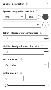
- Speaker designation: The Speaker Designation Group allows you to style the speaker designation text with typography settings such as font size, letter spacing, color, and text transform. You can also configure responsive font sizes separately for Desktop, Tablet, and Mobile devices for optimal display across all screen sizes.
- Profile image: The Profile Image Group allows you to customize the speaker's profile image to match your design requirements. You can easily adjust the image width for Desktop, Tablet, and Mobile devices, as well as customize the image border radius and apply custom border styles.
- Event details block: Use this group to customize the block's border, border radius, and background color according to your design.
- Spacing - Event details items: Optimize the spacing for the Event Details and Event Description list items across desktop, tablet, and mobile. Adjust the spacing as needed to maintain a clean, balanced, and consistent layout on all screen sizes.
- Container custom size: Container width to customize the custom container width.

Support
If you have further questions, please reach out to our team at hawksky3012@gmail.com.