Overview
A "Feature Showcase" module is essentially a presentation or demonstration tool used to highlight various features, functionalities, or capabilities of a product, service, software, or platform. It can be particularly useful in software development, marketing presentations, training sessions, or any scenario where you need to showcase the key aspects of what you're offering.
Features Included
Here are key features and effects that you might find in a "Feature Showcase" module:
- No Coding Knowledge Required: Simple to use, no technical jargon. Streamlined for effortless navigation by anyone.
- Feature Carousel: Implement a feature carousel or slider that displays key features one at a time, enabling users to swipe or tap through different features.
- Interactive Demos: Allow users to interact with the showcased features through interactive demos.
- Clickable Feature: Easily clickable feature items for seamless navigation. Enhance user experience with intuitive design.
- Draggable/Navigation Support: Feature items change on mobile screen drag. And also mobile showcase image and feature items change on click of navigation dots.
- Dark Mode: Switch to Dark Mode for reduced eye strain. Enhance readability in low-light environments.
- Mobile Position: Mobile positions can be set to "Center", "Left" and "Right".
- Feature Icon Position: Icon of feature items can be set to "Top", "Left" and "Right".
- Active Feature Indicator: Visual indication of the currently active feature for user feedback. Highlight the active feature to provide a clear visual cue.
- Smooth Transitions: Use CSS transitions or animations for smooth content transitions when switching between tabs. Enhance the user experience with subtle visual effects.
- Unlimited Style: Endless customization possibilities for design, allowing users to tailor the interface to their preferences without constraints.
- Cross-Browser Compatibility: Test and ensure compatibility with major browsers to provide a consistent experience. Consider using browser prefixes or polyfills for CSS features if needed.
- Responsive Design: Ensure that the feature showcase module is responsive and compatible with various devices and screen sizes, including desktops, laptops, tablets, and smartphones.
By incorporating these key features into a Feature Showcase module, you can create a compelling and engaging presentation that effectively highlights the strengths and capabilities of your product, service, or platform.
Module Setup
Setting up the "Feature Showcase" Module is easy and straightforward. All you have to do is perform a simple drag and drop.
Now let’s go through the setup steps:
- Login to your HubSpot account and left side navigate to the “Content” tab.

- Click on “Content” in the dropdown menu and select “Website Pages” from the extended menu.

- Under the module selection menu, search for “Feature Showcase” and select the module
- Now simply pick the "Feature Showcase" module, drag, and drop it wherever you want on your page. You’ll see a new module appear on the page.
Figure 1: Mobile Center
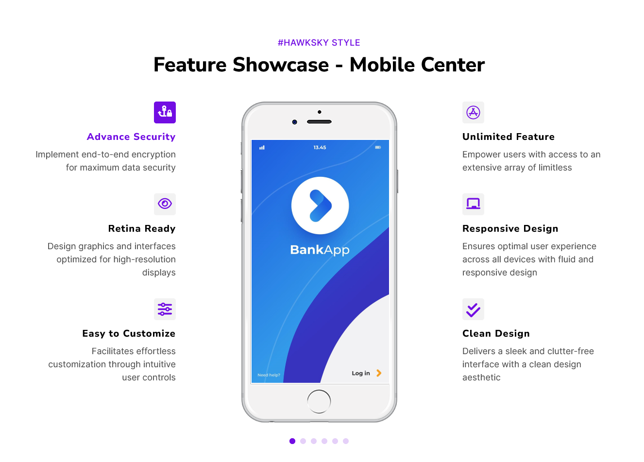
Figure 2: Mobile Left
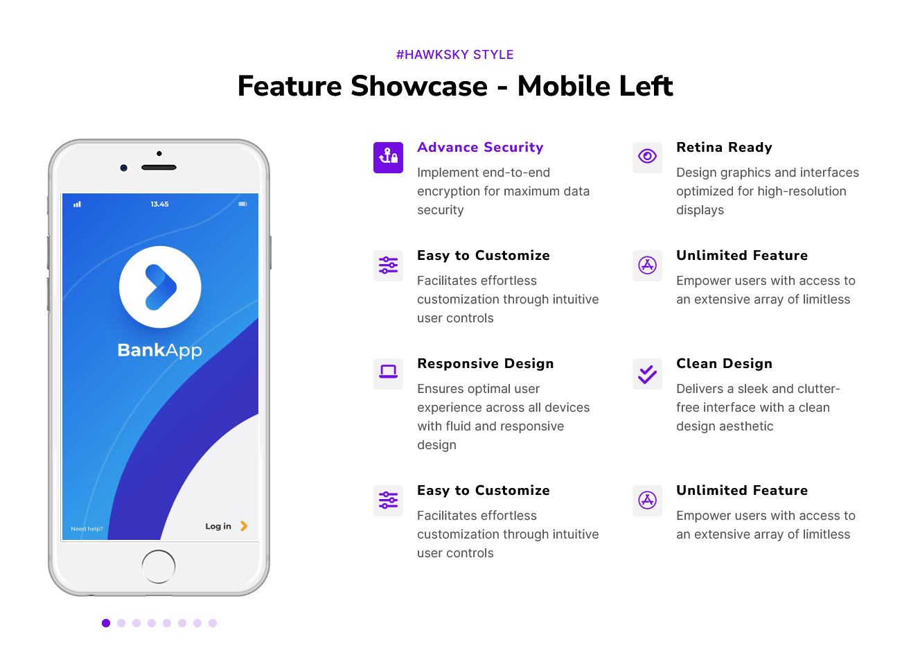
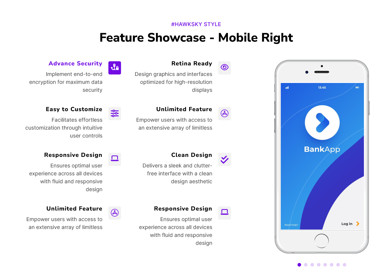
Figure 3: Mobile Right
Content Setting

Under “Content”, you can edit the content you want to be easily adjust and update the “Section layout”, "Enable heading", "Enable animation", "Mobile Position (Center, Left and Right)", "Mobile Iframe Group", "Left side - Feature items", "Right side - Feature items", "Icon Position", "Icon options (Default and Custom icon)","Advanced setting" and more as you please.
Below is an overview listing of module content settings:
- Section layout: Section layouts can be set across module levels. Such as "Container" and "Full width".
- Enable animation: Animation of Heading, feature items and Mobile Iframe can be shown/hidden using "Enable animation" field.

- Enable heading: Section heading can be display using "Enable heading" field
- Section heading: Section heading group includes heading animation, overlay text and heading text.


- Mobile Position: You can set the position of mobile according to your design. Like "Center", "Left" and "Right".

1) If Mobile position, select "Center"

- Leftside - Feature items: Leftside - Feature Items this is the repeater group.
- Animation: You can easily manage the "Left side - Feature item" repeater group animation. Like "Fade", "Flip" and "Zoom".
- Mobile feature image: This image is related to the feature items. You can easily change it.
- Icon: Icon group include the two options such as "Custom Icon" and "Default Icon". You can use whatever you want.

- Feature heading text: You can easily add, update and remove the feature items heading text.
- Mobile Iframe: This group includes the "Animation" and "Mobile frame".

- Rightside - Feature items: Rightside - Feature Items, this is the repeater group. Same as above, "Leftside - Feature items".
2) If Mobile position, select "Left"

- Mobile Iframe: Same as above, Mobile position "Center" group "Mobile Iframe"
- Rightside - Feature items: Same as above, Mobile position "Center" group "Rightside - Feature items".
3) If Mobile position, select "Right"

- Leftside - Feature items: Same as above, Mobile position "Center" group "Leftside - Feature items".
- Mobile Iframe: Same as above, Mobile position "Center" group "Mobile Iframe"
- Leftside - Feature items: Leftside - Feature Items this is the repeater group.
- Advanced setting: This group includes the "Feature items Alignment (Left, Right and Center) There is support for desktop and mobile." and "Icon position (Top, Left and Right)".

- Module JS: Include the module level jQuery show/hide field.
Style Setting

- Section: Under section spacing and background to manage module background solid color, background gradient and background image with overlay solid color and gradient. And spacing to easily manage desktop, tablet and mobile padding.

- Section heading: Easy customize the overline text typography font, color, line height, text transform and font weight and Heading alignment and spacing.
- Feature items: This group includes,

- Icon: Easy customize the "Icon color", "Icon size", "Icon box background color (Solid and Gradient)", "Border radius (Top Left, Top Right, Bottom Right and Bottom Left) Corner", "Border", "Spacing" and so on.
- Background: This group is feature item's background custom style. Such as "solid" and "gradient" colors.

- Border radius: You can set the border radius as per your design. Such as "Top Left", "Top Right", "Bottom Right" and "Bottom Left" corner.
- Border: You can set the border as per your design.
- Spacing: You can manage the spacing as per your design.
- Enable boxshadow: Using the field to show/hide the feature item custom boxshadow.

- Active - Feature items: This group includes, "Icon color", "Icon background color (Solid and Gradient)", "Border color", "Heading text color", "Heading description color", "Feature items background (Solid and Gradient)", "Border color" and "Enable boxshadow".
- Slider navigation: Slider navigation includes, "Dots size", "Background color", "Border radius", "Border", "Active dots (Background color and Border color)" and "Hover dots (Background color and Border color)".
- Container custom size: Container width to customize the custom container width.
Support
If you have further questions, please reach out to our team at hawksky3012@gmail.com.