Overview
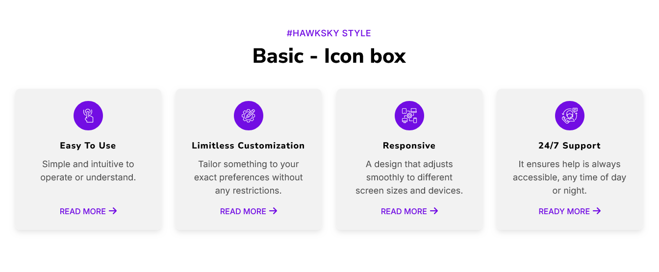
"IconService Cards" Modules are visual design elements commonly used in web development and design systems. These modules combine icons with short text descriptions, button to highlight features, services, or categories in a compact and visually appealing way. They're typically used to grab attention, improve user engagement, and help users quickly understand key concepts or navigate through a website. It's easy, mobile-friendly and the special thing about this module is that you can set it according to your design and requirements.
Features Included
Here are key features and effects that you might find in a "IconService Cards" module:
- Cards Layouts: Multiple cards layouts options are provided in this module. Such as "Basic", "Left side icon", "Right side icon", "Zig-zag Up first", "Zig-zag Down first", "Steps Up", "Steps Down", "Bordered (All border, Top border and Bottom border)", "Transition effect box (Top transition and Tilt 3d effect)", "Background/Withour background", "Hover color (Solid & Gradient)" etc.
- Interactive Elements: The interactive Elements used in this module are:
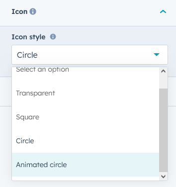
- Icon: A visual representation of the feature or service. Different styles are used to represent icons. Like "Transparent Icon", "Circle Icon", "Square Icon" and "Animated Icon". Icon customization like,
- Icon Libraries: Ability to choose icons from popular libraries like Font Awesome, or custom SVG/png/jpg uploads.
- Icon Size: Adjustable icon size (small, medium, large) to fit various layouts and designs.
- Icon Color: Options to customize the icon color, including solid, background color (Solid and Gradient) and hover effects.
- Icon Shape: Icons can be displayed in different shapes (e.g., circular, square and backgrounds).
- Animated Icons: Support for animated icons (e.g., hover effects and pulsing) to add interactivity.
- Title/Heading: A short, catchy label that summarizes the feature (e.g., “Web Design” or “24/7 Support”).
- Description: A brief explanation of the feature.
- Button: Option to include a call-to-action (CTA) button within or below the icon box. Different button styles like "Filled Button", "Border Button", "Text Button" and "Arrow Only Button".
- Clickable Links: Ability to add links to each icon box (e.g. navigating to another page and opening a new tab).
- Icon: A visual representation of the feature or service. Different styles are used to represent icons. Like "Transparent Icon", "Circle Icon", "Square Icon" and "Animated Icon". Icon customization like,
- Grid and Columns Layouts: Set the number of columns (e.g.1 to 12 columns support) for displaying several icon boxes side by side.
- Spacing Between Boxes: Customizable gap/margin between each icon box for cleaner or more compact layouts.
- Hover Effect: You can set the card hover effect like "Transition top", "Tilt 3D effect".
- Background (Initial and Hover): You can set the background color (Solid and Gradient) at start and on hover.
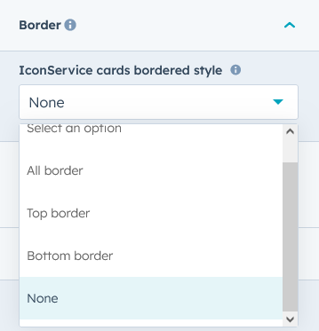
- Border style: You can set the border style such as "All border", "Top border", "Bottom border" and "None".
- Box Alignment: Flexibility to align the entire icon box within the page (left, center, right).
- Box Inner Spacing and Padding: Adjust spacing between the icon and text, as well as padding around the entire box.
- Border Radius: You can add and remove the border radius of all the boxes with one click. And you can also customize the border radius as per your design and requirement.
- Interactive Demos: Allow users to interact with the IconService Cards through interactive demos. Click here view demo
- Smooth Transitions and Animations: Implementation of visually appealing transitions and animations to provide a polished and modern user experience.
- Design and Customization: Endless customization possibilities for design, allowing users to tailor the interface to their preferences without constraints. Offers flexibility to customize according to the specific needs and requirements of the project or workflow.
- Cross-Browser Compatibility: Test and ensure compatibility with major browsers to provide a consistent experience. Consider using browser prefixes or polyfills for CSS features if needed.
- Responsive Design: Ensure that the IconService Cards module is responsive and compatible with various devices and screen sizes, including Desktops, Laptops, Tablets, and Smartphones.
IconService Cards Modules offer a wide range of customizable features that make them suitable for a variety of use cases, from simple feature highlights to complex, dynamic content presentations. Their flexibility in design, layout, and interactivity ensures they can meet the needs of different websites and platforms, while remaining visually engaging and user-friendly.
Module Setup
Setting up the "IconService Cards" Module is easy and straightforward. All you have to do is perform a simple drag and drop.
Now let’s go through the setup steps:
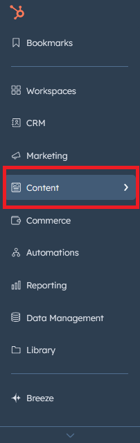
- Login to your HubSpot account and left side navigate to the “Content” tab.
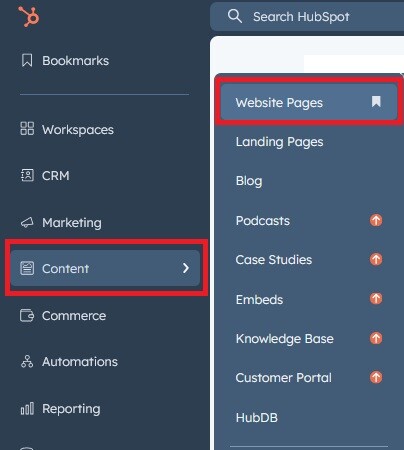
- Click on “Content” in the dropdown menu and select “Website Pages” from the extended menu.
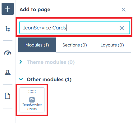
- Under the module selection menu, search for “IconService Cards” and select the module
- Now simply pick the "IconService Cards" module, drag, and drop it wherever you want on your page. You’ll see a new module appear on the page.
Figure: Drag and Drop View
Content Setting
Figure 1: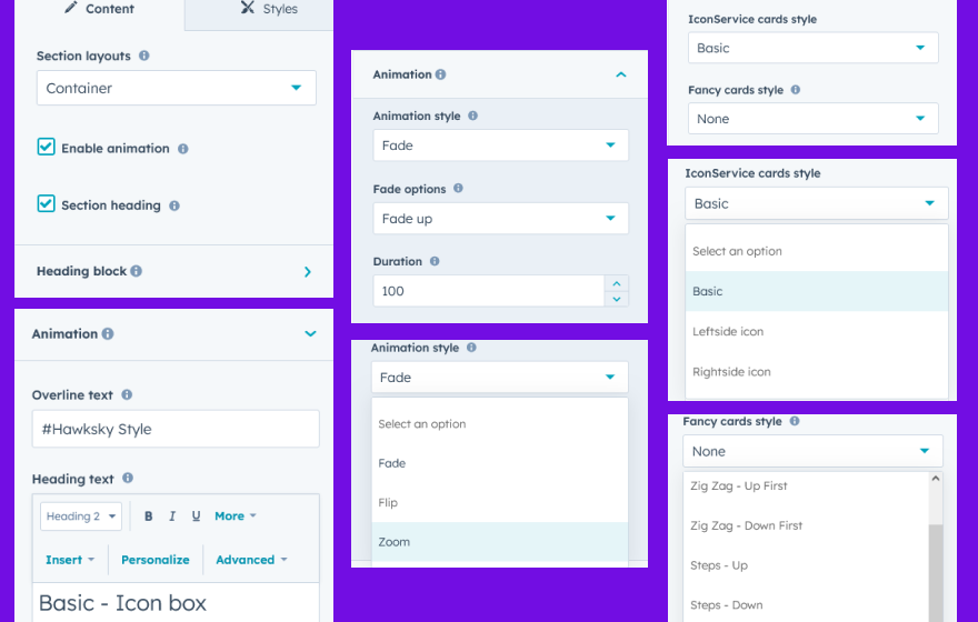
Figure: 2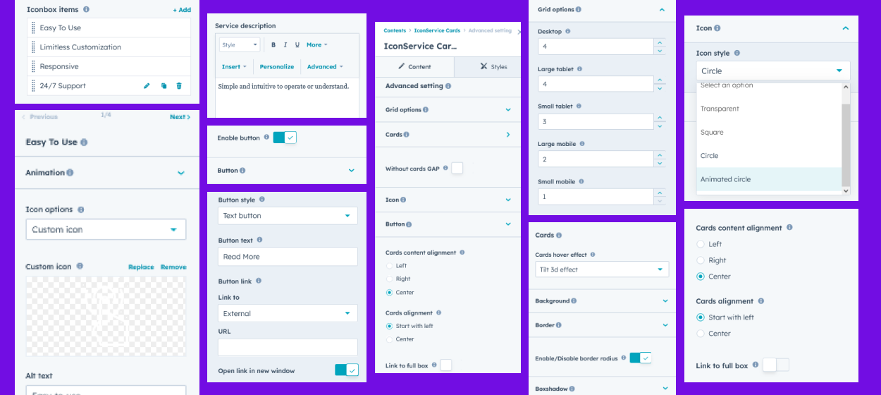
Under “Content”, you can edit the content you want to be easily adjust and update the “Section layout”, "Enable heading", "Enable animation", "IconService cards style", "Fancy cards style", "Iconbox items (Repeater items)", "Icon (Default and Custom icon)", "Iconbox heading", "Iconbox descriptions", "Iconbox button", "Iconbox full box link", "Advanced setting" and more as you please.
Below is an overview listing of module content settings:
- Section layout: Section layouts can be set across module levels. Such as "Container" and "Full width".
- Enable animation: Animation of Heading and Repeater Iconbox items can be shown/hidden using "Enable animation" field.

- Enable heading: Will show and hide section heading when checked/unchecked "Enable heading" field.
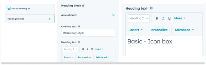
- Animation: This group includes a field to animate headings. Like "Fade", "Flip" and "Zoom".
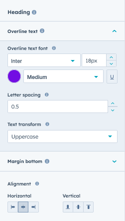
- Overline text: You can use this field as a section highlight keyword.
- Heading text: This field as a section heading text.
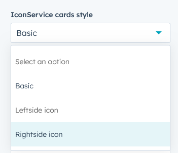
- IconService cards style: You can change the icon box style on click. Styles like "Default", "Leftside icon" and "Rightside icon".
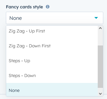
- Fancy cards style: You can also set the fancy style in the style selected above. Like "Zig Zag - Up First", "Zig zag - Down first", "Steps - Up", "Steps - Down" and "None".
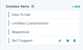
- Iconbox items: This is a repeater group. You can add/remove/delete icon box items as per your wish. You can add as many as you want. As per design and requirement.
- Animation: This group includes a field to animate icon box items. Like "Fade", "Flip" and "Zoom".
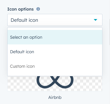
- Icon: "Default" and "Custom" icons can be used based on your design and requirement.
- Service title: You can add/update/delete service title in your own way.
- Enable button: Using this field, you can enable/disable icon box button.
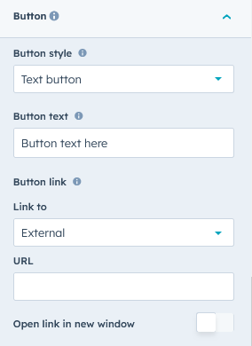
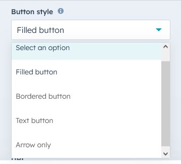
- Button style: Using this field you can change the button style like "Filled button", "Bordered button", "Text button" and "Arrow only".
- Button text: You can add/update/delete button text your way.
- Button link: You can add/update/delete button link your way.
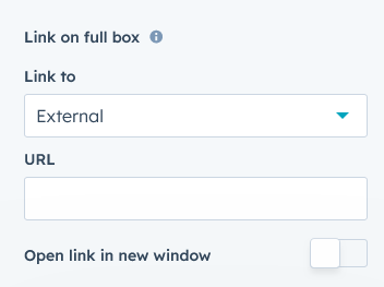
- Link on full box: If you want to keep the link across the entire box you can. Go to "Advanced Settings" and enable the "Link to Full Box" field, then you will see "Link to Full Box" in the "Iconbox Items" repeater group. From there you can set the link.
- Button style: Using this field you can change the button style like "Filled button", "Bordered button", "Text button" and "Arrow only".
- Advanced setting: You can customize the module as per your design and requirement using advanced settings.
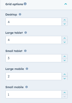
- Grid options: You can change the Icon Box Grid to "Desktop", "Large Tablet", "Small Tablet", "Large Mobile" and "Small Mobile" using the Grid Options field.
- Cards: Cards related advanced settings are included in the Cards group.
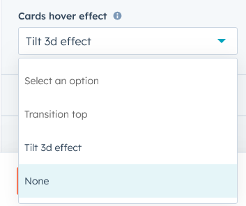
- Cards hover effect: Using the "Card Hover Effect" field, you can give simple hover effects like "Transition Top" and "Tilt 3D Effect" to icon box cards on hover.
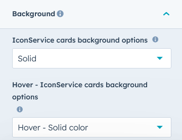
- Background: You can directly change icon box background "Solid", "Gradient" color and hover "Solid" and "Gradient" color using advanced settings.
- Border: If you want to give a border style to the Icon box you can also do that. Like "Top Border", "All Border" and "Bottom Border".
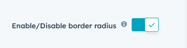
- Enable/Disable border radius: You can show/hide icon box border radius on one click using this field.
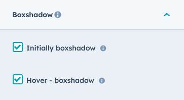
- Boxshadow: On check box check/uncheck you can show/hide icon box "box shadow". And you can also customize box shadow from style as per design and requirement.
- Cards hover effect: Using the "Card Hover Effect" field, you can give simple hover effects like "Transition Top" and "Tilt 3D Effect" to icon box cards on hover.
- Without cards GAP: You can enable/disable spacing between cards with one click.

- Icon: You can also present icons in different styles. Like "Transparent", "Circle", "Square" and "Animated Circle".
- Button: When you select button text from button style then this group will be seen. From here you can enable/disable button text arrow icon.
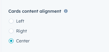
- Cards content alignment: You can give the icon box content alignment as per your design and requirement. Like "Left", "Right" and "Center". Note - This functionality will not be available if you select "Leftside Icon" and "Rightside Icon" from "IconService Cards Style".
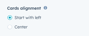
- Cards alignment: Using this functionality you can start the card from the left side or start the card from the center.
- Link to full box: You can set the link to the entire card using this field. When enabled, the link field will appear in the icon box items repeater group.

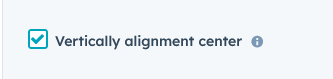
- Vertically alignment center: Check the checkbox if you want to center the box content vertically. If you only use icons and headings, use this functionality. See Demo Page #Style 1.5
- Grid options: You can change the Icon Box Grid to "Desktop", "Large Tablet", "Small Tablet", "Large Mobile" and "Small Mobile" using the Grid Options field.
- Module JS: Includes the module level jQuery CDN show/hide field. If you don't need it, you can disable this field.
Style Setting

- Section: Under section spacing and background to manage module background solid color, background gradient and background image with overlay solid color and gradient. And spacing to easily manage desktop, tablet and mobile padding.

- Heading: Easy customize the overline text typography font, color, line height, text transform and font weight and Heading alignment and spacing.
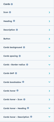
- Cards: This group includes "Icon", "Heading", "Description", "Button", "Cards Background", "Cards Box shadow", "Cards Bordered", "Cards Border Radius", "Cards GAP", and "Hover" styles.
- Icon: These groups contain all custom styles for card icons. As per the list below,
- Default icon color: If you use the default icon, you can change its color from this field.
- Square size: This group will be visible if you select "Square" in icon Style from Advanced Settings. You can set the width and height of the square manually.
- Circle Size: You can set the height and width of the circle in the same way as the square.
- Animated circle size: You can set the size of the animated circle size in the same way as the square.
- Border radius: Using this field, you can set the border radius of the square.
- Background: Use this group to customize icon square and circle background "Solid" and "Gradient".
- Bordered: Using this field, you can set the border of the square and circle.
- Margin bottom: This group includes, margin bottom of icon, you can set on devices like "Desktop", "Tablet" and "Mobile".
- Heading: Card heading style you can customize like "Text Color", "Text Font Size", "Text Font Weight", "Text Transform", "Text Font Family", "Margin Bottom", "Tablet Font Size" and "Mobile Font size"
- Description: This group includes a margin bottom for the description of the cards. Such as "Desktop", "Tablet" and "Mobile".
- Button: If you want to customize the style of the button, you will find it in this group.
- Text Transform: You can make button text "uppercase", "lowercase" and "capitalized" using this field.
- Filled button: You can customize the filled button style such as "Text color", "Font size", "Font weight", "Font family", "Background color (Solid and Gradient)", "Border radius", "Bordered", "Hover text color", "Hover background color (Solid and Gradient)", and "Hover bordered color".
- Bordered button: You can customize the bordered button style such as "Text color", "Font size", "Font weight", "Font family", "Background color (Solid and Gradient)", "Border radius", "Bordered", "Hover text color", "Hover background color (Solid and Gradient)", and "Hover bordered color".
- Text button: You can customize the text button style such as "Text color", "Text font family", "Text font size", "Font weight", and "Text hover color".
- Arrow only button: You can customize the arrow only button style such as "Icon size", "Icon circle width and height", "Border radius", "Circle background color (Solid and Gradient) and "Hover icon color", "Hover circle background color (Solid and Gradient)"
- Alignment: Using this field you can set the alignment of button like "Left", "Right" and "Center".
- Cards background: This group includes cards background colors like "Solid" and "Gradient". You can customize as per your design and requirement.
- Background solid color: This field will be appeared when selecting "Solid" from Cards Background options from Advanced Settings. Using this field, you can customize the background solid color of the card as per the design and requirement.
- Background gradient color: This field will be appeared when selecting "Gradient" from Cards Background options from Advanced Settings. Using this field, you can customize the background gradient color of the card as per the design and requirement.
- Cards spacing: Using this group, the internal spacing of the cards can be customized as per your design and requirement. Such as "Desktop", "Tablet" and "Mobile".
- Cards border: This group includes cards border like "All side border", "Top border" and "Bottom border". You can customize as per your design and requirement.
- All border: This field will be appeared when selecting "All bordered" from Cards bordered style from Advanced Settings. Using this field, you can customize the all border style of the card as per the design and requirement.
- Top border: This field will be appeared when selecting "Top bordered" from Cards bordered style from Advanced Settings. Using this field, you can customize the top border style of the card as per the design and requirement.
- Bottom border: This field will be appeared when selecting "bottom bordered" from Cards bordered style from Advanced Settings. Using this field, you can customize the bottom border style of the card as per the design and requirement.
- Cards Bordered radius: You can customize the border radius of the cards yourself. Like "Top left corner", "Top right corner", "Bottom right corner" and "Bottom left corner".
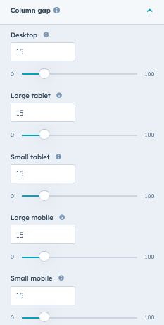
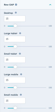
- Cards GAP: By using this group, you can set the column spacing and row spacing of the card according to your design.
- Column GAP: Using this group, cards column spacing can be customized for "Desktop", "Tablet" and "Mobile".
- Row GAP: Using this group, cards row spacing can be customized for "Desktop", "Tablet" and "Mobile".
- Column GAP: Using this group, cards column spacing can be customized for "Desktop", "Tablet" and "Mobile".
- Zig zag - Up first spacing: This group will appear when selecting "Zig Zag - Up First" from "Fancy Cards Style". You can set a margin on top of each even card. Such as "Desktop", "Tablet" and "Mobile".
- Zig zag - Down first spacing: This group will appear when selecting "Zig Zag - Down First" from "Fancy Cards Style". You can set a margin on top of each odd card. Such as "Desktop", "Tablet" and "Mobile".
- Fancy cards - Steps Up: This group will appear when selecting "Steps - Up" from "Fancy Cards Style". You can set a margin on top of each card. Such as "Desktop", "Tablet" and "Mobile". So the card will be seen in the up step.
- Fancy cards - Steps Down: This group will appear when selecting "Steps - Down" from "Fancy Cards Style". You can set a margin on top of each card. Such as "Desktop", "Tablet" and "Mobile". So the card will be seen in the down step.
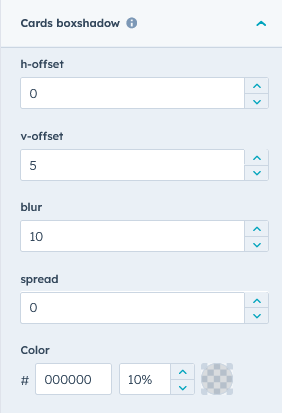
- Cards box shadow: This group will appear when selecting "Initially box shadow" from Cards Box shadow style from Advanced Settings. You can customize the box shadow yourself.
- Cards hover: Hover style of cards is included in this group.
- Background: You can set the hover color of your card like "Solid" and "Gradient". As per your design and requirement.
- Background solid color: This field will be appeared when selecting "Solid" from "Hover - IconService cards background options" in Advanced Settings. Using this field, you can customize the background solid color of the card as per the design and requirement.
- Background gradient color: This field will appear when selecting "Gradient" from "Hover - IconService Cards Background Options" in Advanced Settings. Using this field, you can customize the background gradient color of the card as per the design and requirement.
- Border color: Use this field to change border hover color as per design and requirement.
- Box shadow: This group will appear when selecting "Hover - box shadow" from Cards Box shadow style from Advanced Settings. You can customize the hover box shadow yourself.
- Background: You can set the hover color of your card like "Solid" and "Gradient". As per your design and requirement.
- Cards hover - Icon: This group contains, you have to change default icon hover color, background color (solid and gradient) and custom icon hover enable/disable filter option.
- Default icon color: Using this field, you can change the default icon hover color.
- Enable custom image icon filter: Using this field, you can change the custom image icon hover color filtering.
- Background: Included in this group, you can change the icon background color (solid and gradient).
- Border color: Using this field, you can change the color of the square or circle icon border.
- Cards hover - Heading: Using this field, you can change the hover color of heading text.
- Cards hover - Description: Using this field, you can change the hover color of description text.
- Icon: These groups contain all custom styles for card icons. As per the list below,
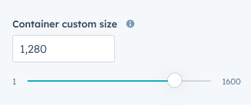
- Container custom size: Using this field, you can customize the container width.
Support
If you have further questions, please reach out to our team at hawksky3012@gmail.com.