Overview
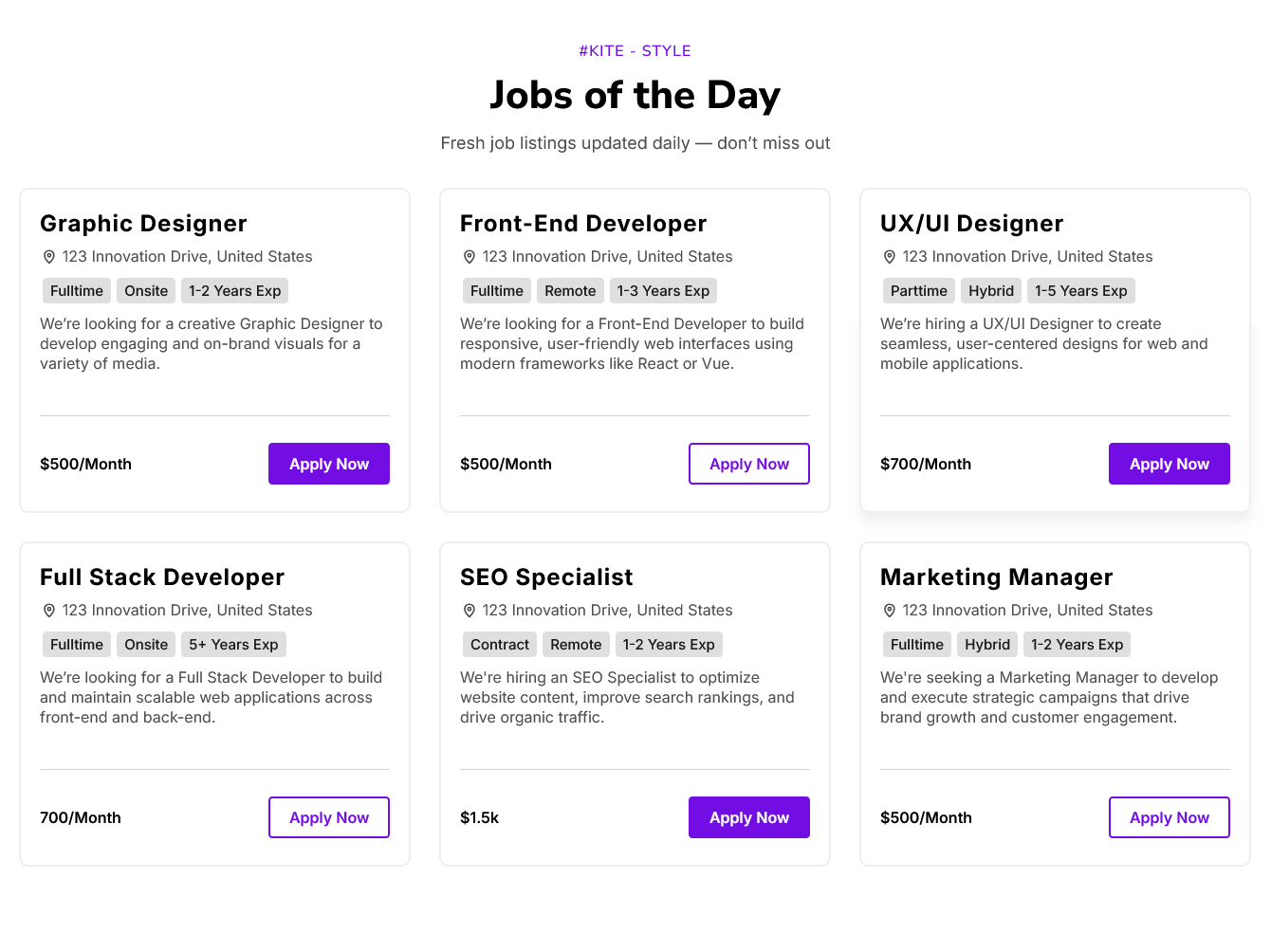
The "Job Listings" module provides a structured and efficient way to publish and manage employment opportunities on a website or internal platform. It supports the full lifecycle of a job post—from creation and display to application and expiration—making it easier for organizations to connect with potential candidates.
Features Included
Here are key features and effects that you might find in a "Job Listings" module:
- Job Posting Management: Create, edit, delete, and publish job listings with fields like title, description, location, category, package, experience details and employment type etc.
- Job Post Limit: There is no limit to the number of jobs you can post.
- Apply Functionality: Allows users to apply directly or via external application links.
- Flexible Column Setting: Up to five columns can be displayed per row, with the layout adapting seamlessly to different screen sizes, including desktop, tablet, and mobile.
- Flexible GAP Setting: Column and row spacing adapts responsively and is supported across breakpoints for desktop, tablet, and mobile views.
- Box Hover Effect: A visual interaction where a box or card changes appearance—such as color, shadow, or size—when the user hovers the cursor over it, enhancing engagement and indicating interactivity.
- Interactive Demos: Allow users to explore Job Listings through interactive demos. [Click here to view the demo.]
- Design Control: Easily customize colors, images, fonts, spacing, background (Solid color, Gradient color and Image), border, hover style, box shadow, button style, animations, and alignment to keep your design on brand.
- Smooth Animations: Attracts the user's attention, improves the intuitiveness of the user interface, and contributes to a modern and attractive design.
- Responsive & Mobile-Optimized: Ensures a seamless and accessible user journey, accommodating users on different devices without compromising functionality or design. And Optimized for mobile, tablet, and desktop for consistent user experience across devices.
The Job Listings module is a versatile and practical UI component that enhances the organization and presentation of job-related content on websites.
Module Setup
Setting up the "Job Listings" Module is easy and straightforward. All you have to do is perform a simple drag and drop.
Now let’s go through the setup steps:
- Login to your HubSpot account and left side navigate to the “Content” tab.

- Click on “Content” in the dropdown menu and select “Website Pages” from the extended menu.

- Under the module selection menu, search for “Job Listings” and select the module
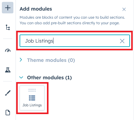
- Now simply pick the "Job Listings" module, drag, and drop it wherever you want on your page. You’ll see a new module appear on the page.
Content Setting
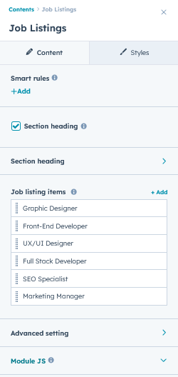
Under “Content”, you can edit the content you want to be displayed on your Job Listings section. Easily edit, delete and update the “Section heading”, "Overline text", "Heading text", "Animation", "Job listing items (Repeater)", "Job title", "Job Location", "Hiring mode", "Location Mode", "Experience", "Button" and "Advanced setting", "Module JS" and more as you please.
Below is an overview listing of module content settings:
- Section heading: Enable section headings to show the main heading at the top of the section. This is an optional field.

- Animation: You can use animations for section heading, which give a smooth effect on page scrolling. Such as "fade", "flip" and "zoom".

- Overline text: Overline text is a small line of text placed above a heading or title, often used to provide context or categorize content. This is an optional field.
- Heading text: Heading text is used to define titles or sections, helping organize content and improve readability.
- Animation: You can use animations for section heading, which give a smooth effect on page scrolling. Such as "fade", "flip" and "zoom".
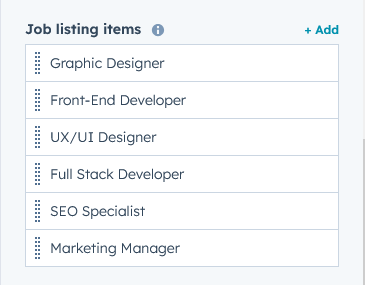
- Job listing items: This is a repeating group of items. You can edit, delete, and update job post data yourself.
- Animation: Animations like "fade," "flip," and "zoom" can be applied to job post items, creating smooth visual effects as users scroll through the page.
- Job title name: Use this field to edit and update the job title text.
- Job location: Use this field to edit and update the job location text.
- Mode of job: This group includes the "Hiring Mode", "Location Mode", and "Experience" fields.
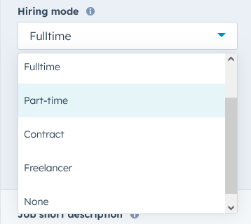
- Hiring mode: You can select "Full-time", "Part-time", "Contract", "Freelancer" from the hiring mode choice field according to your needs and design. This is a field of choice. And there is also an optional field.
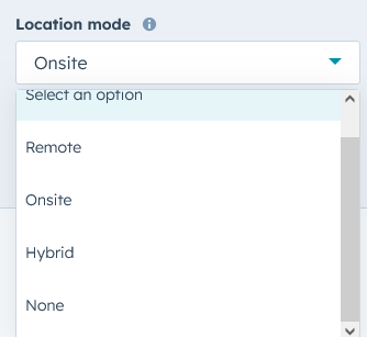
- Location mode: You can select "Onsite", "Remote", "Hybrid" from the location mode choice field according to your needs and design. This is a field of choice. And there is also an optional field.
- Experience: Use this field to edit and update the job experience text. And there is also an optional field.
- Hiring mode: You can select "Full-time", "Part-time", "Contract", "Freelancer" from the hiring mode choice field according to your needs and design. This is a field of choice. And there is also an optional field.
- Job short description: A brief summary outlining the key responsibilities, qualifications, and purpose of the job role. This is an optional field.
- Job package: Use this field to edit and update the job package. This is an optional field.
- Button: Allows users to apply directly or via external application links.
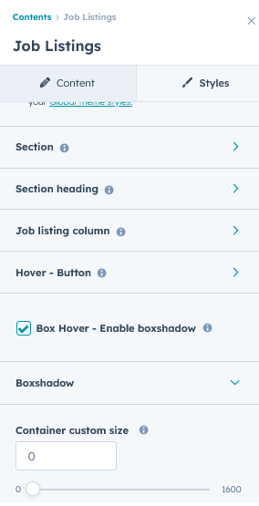
- Advanced settings: This group includes "Section ID", "Section Class", "Section Layout", "Grid Display", "Enable Hover" and "Show/Hide Box Shadow", etc.
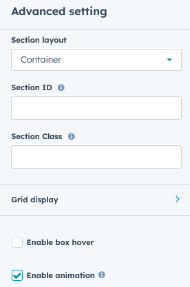
- Grid display: From here, the grid spacing and number of column displays will be managed.
- Column display setting: From here, the number of column displays will be managed.
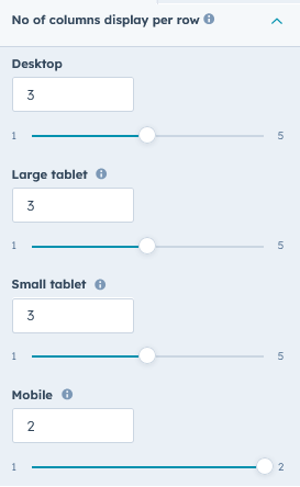
- Column display setting: From here, the number of column displays will be managed.
- Grid GAP setting: From here, the grid spacing will be managed.
- Columns GAP: From here, the grid columns spacing will be managed.
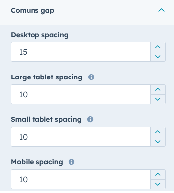
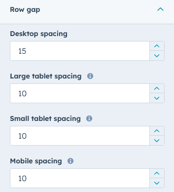
- Row GAP: From here, the grid row spacing will be managed.
- Columns GAP: From here, the grid columns spacing will be managed.
- Grid display: From here, the grid spacing and number of column displays will be managed.
- Module JS: Include the module level jQuery show/hide field.
Style Setting
- Section: Under section background to manage module background solid color, background gradient and background image with overlay solid color and gradient. And spacing to easily manage desktop, tablet and mobile padding.

- Section heading: Easily customize text typography—including font, color, line height, text transform, letter spacing, font weight, and alignment—and manage spacing across desktop, tablet, and mobile devices.
- Job listing column: Easily customize column background (Solid color, Gradient color), Border radius, Border, box shadow, spacing (desktop, tablet and mobile), and easily customize text typography—including font, color, line height, text transform, letter spacing, font weight, and alignment—and manage spacing across desktop, tablet, and mobile devices.
- Hover - Job listing column: Easily customize column hover background (Solid color, Gradient color), Border color, box shadow, and easily customize column hover text typography color and job mode background color.
- Hover - Button: Easily customize button hover background (Solid color, Gradient color), Border color, text color.
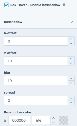
- Hover - Column box shadow: Easily customize column hover box shadow.
- Container custom size: Container width to customize the custom container width.

Support
If you have further questions, please reach out to our team at hawksky3012@gmail.com.