Overview
A "Masonry Filterable Portfolio" module typically consists of several components that work together to create a visually appealing and user-friendly portfolio showcase with the ability to filter and sort projects based on different categories. In HTML, a div with the class "portfolio" contains items represented by DIVS with the class "item," each displaying project images. CSS styles configure the layout, utilizing flex box for responsiveness. The JavaScript file, using jQuery, initializes the masonry grid, controlling item arrangement. Adjustments involve replacing image placeholders, modifying CSS for spacing, and ensuring proper jQuery inclusion. This minimalistic setup allows for an organized and visually appealing presentation of projects in a dynamic grid format.
Features Included
Here are some key features and effects that you might find in a portfolio with "Masonry Filterable Portfolio" module:
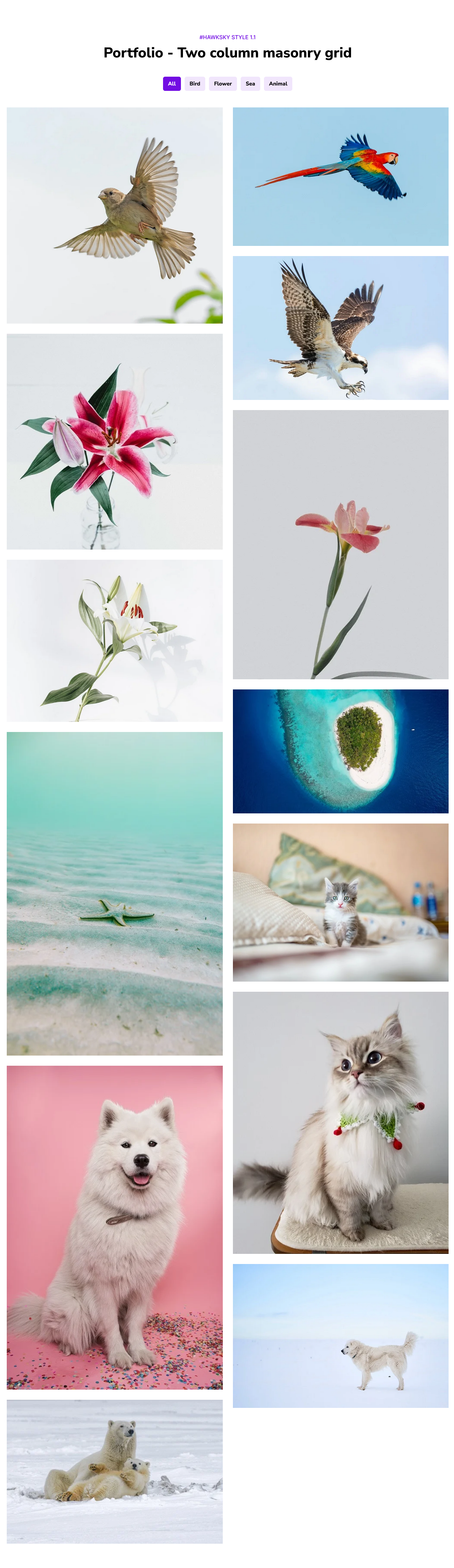
- Dynamic Layout: The masonry grid adjusts dynamically to the screen size and the aspect ratios of project images, creating an organized and fluid layout.
- Filtering Mechanism: The ability to filter projects based on categories is a fundamental feature. Users can select a category (e.g., type of project, industry, etc.) to view only those projects that match the chosen criteria.
- Filter Buttons: Filter buttons provide a user-friendly interface for selecting different categories. Each button is associated with a specific category, and clicking on a button triggers the display of projects belonging to that category.
- Link: Portfolio link to manage the external and internal pages link
- Responsive Design: The portfolio module is designed to be responsive, ensuring that it adapts to various screen sizes and devices. This responsiveness is crucial for a consistent user experience across desktops, tablets, and mobile devices.
- Customization Options: Users may have the option to customize the appearance of the portfolio, such as choosing the number of columns in the Masonry layout, selecting color schemes, and adjusting typography.
- Animation/Transition: Animations and transitions can be applied to the filtering process or the layout changes, providing a visually engaging and polished user experience.
-
Accessibility: It's important to ensure that Masonry Filterable Portfolio modules are designed with accessibility in mind.
- Efficient Content Presentation: Instead of overwhelming users with a static display of all projects, the filtering feature ensures that users see content that is most relevant to them. This efficient presentation of content contributes to a positive and focused user experience.
By combining these key features, a Masonry Filterable Portfolio module provides a dynamic and interactive platform for showcasing projects while giving users the flexibility to explore and filter content based on their preferences.
Setting up the "Masonry Filterable Portfolio" Module is easy and straightforward. All you have to do is perform a simple drag and drop.
Now let’s go through the setup steps:
- Login to your HubSpot account and left side navigate to the “Content” tab.

- Click on “Content” in the dropdown menu and select “Website Pages” from the extended menu.

- Under the module selection menu, search for “Masonry Filterable Portfolio” and select the module
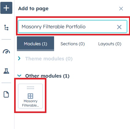
- Now simply pick the "Masonry Filterable Portfolio" module, drag, and drop it wherever you want on your page. You’ll see a new module appear on the page.
Content Setting

- Under content include the field "Enable module", "Layout", "Enable heading", "Heading Group", "Portfolio Group" and "Module js Group"
- Enable module: Show/hide module using "Enable module" field
- Layout: Manage the section layout like "Container" and "Full width"
- Enable heading: Show/hide heading group
- Heading:
- Enable animation: Show/hide section heading animation
- Animation: Animation dropdown include the "Animation style" choice field, "Fade options" choice field, "Flip options" choice field, "Zoom options" choice field and "Duration" field
- Overline text: Overline text to highlight the keyword
- Heading text: Heading text provides a snapshot of the content that follows, indicating that the focus is on creativity, empowerment, and innovative solutions.
- Portfolio:
- Enable filter: Show/hide Portfolio filter
- Portfolio Column: Portfolio column is choice field provides a portfolio gird flexibility.
- Portfolio items: Portfolio items are repeater group. It's include the "Filter name" and "Portfolio info" repeater field. Portfolio info repeater group include the "Portfolio image", "Title", "Subtitle" and "Portfolio link".
-
- Enable portfolio standard layout: Enable this if you don’t need the Masonry Portfolio layout. Note- Portfolio items must be uploaded in the same size.

- Module JS: Include the module level jQuery show/hide field.
- Enable portfolio standard layout: Enable this if you don’t need the Masonry Portfolio layout. Note- Portfolio items must be uploaded in the same size.
Style Setting

- Section: Under section spacing and background to manage module background solid color, background gradient and background image with overlay solid color and gradient. And spacing to easily manage desktop, tablet and mobile padding.
- Heading: Easy customize the overline text typography font, color, line height, text transform and font weight and Heading alignment and spacing.
- Filter: Customize the filter text style like "alignment", "Font", "Text transform", "Border", "Border radius", "Background color", "Spacing".
- Hover: Manage the filter text hover style like "Text color", "Background color" and "Border color"
- Active: Manage the filter text active style like "Text color", "Background color" and "Border color"
- Margin bottom: Margin bottom provides a customized the bottom spacing "Desktop", "Tablet" and "Mobile"
- Portfolio items:
- Title: Title color, font size, text transform and alignment can be customized easily
- Border radius: You can also give a border radius to the portfolio grid
- Overlay background: Easily customized the portfolio info overlay background solid and gradient color
- Gap: Customized the grid spacing easily
- Portfolio information spacing: Manage the overlay information spacing "Desktop", "Tablet" and "Mobile"
- Container: Container width to customize the custom container width.
Support
If you have further questions, please reach out to our team at hawksky3012@gmail.com.