Overview
The "Media Popup Gallery" Module enhances the user experience by allowing seamless interaction with media (images or videos) on a web page. Instead of redirecting or loading a new page, users can click on thumbnails and view the media in a larger, centered popup overlay—known as a light box or modal view.
Features Included
Here are key features and effects that you might find in a "Media Popup Gallery" module:
- Thumbnail Grid Layout: Displays media items in a structured, clickable gallery—usually in grid format.
- Popup/Light box Modal: Opens selected media in an overlay above the current page without redirecting.
- Navigation Controls: Arrows or buttons to move to the next/previous media item in the gallery. Swipe gestures (on mobile).
- Keyboard Support: Navigate using arrow keys and close the modal with the ESC key.
- Media Types: Supports images (JPEG, PNG, GIF). Supports video (MP4, YouTube/Vimeo embeds and HubSpot Uploaded File).
- Media Captions/Title: Toggle on/off media item captions or title.
- Columns Display Setting: You can customize the Columns display settings yourself according to your design. That too for desktop, tablet and mobile.
- Grid GAP Setting: You can set the grid gap for desktop, tablet, and mobile.
- Grid Height Setting: You can set the grid height for desktop, tablet, and mobile.
- Transitions & Animations: Smooth visual effects like fade, slide, or zoom when page scrolling.
- Interactive Demos: Allow users to interact with the Global Footer Pro through interactive demos. Click here view demo
- Limitless Customization Style: Highly flexible, design-forward module that empowers brands to fully tailor the media popup gallery to match their identity, functionality, and user experience goals. It adapts to various layouts, use cases, and content types, offering maximum creative control.
- Responsiveness and Adaptability: Automatically adjusts to screen sizes for mobile, tablet, and desktop.
The Media Popup Gallery Module provides an engaging way to showcase images and videos with responsive layouts and interactive light box functionality. It enhances user experience through smooth navigation, customization options, and performance optimization. Ideal for portfolios, e-commerce, and content-rich websites.
Module Setup
Setting up the "Media Popup Gallery" Module is easy and straightforward. All you have to do is perform a simple drag and drop.
Now let’s go through the setup steps:
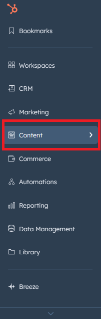
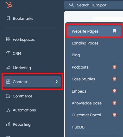
- Login to your HubSpot account and left side navigate to the “Content” tab.
- Click on “Content” in the dropdown menu and select “Website Pages” from the extended menu.
- Under the module selection menu, search for “Media Popup Gallery” and select the module

- Now simply pick the "Media Popup Gallery" module, drag, and drop it wherever you want on your page. You’ll see a new module appear on the page.
Figure: Drag and Drop View


Support
If you have further questions, please reach out to our team at hawksky3012@gmail.com.