Overview
The "MediaText Column Flipper" module is a tool designed to rotate or flip the contents of columns in a media text file. The selected columns are then transformed according to the chosen flipping or rotating method. For example, flipping could involve reversing the order of elements within each column, while rotating might involve shifting the elements within a column by a certain number of positions. MediaText Column Flipper module provides a convenient way to manipulate columnar data within media text files, offering flexibility and efficiency in data processing workflows.
Features Included
Here are key features and effects that you might find in a "MediaText Column Flipper" module:
- Column Selection: Users can select columns to be flipped. This selection can be based on column position or header names, providing flexibility in data manipulation.
- Flip Column: Column flip can be done easily in desktop and mobile
- Column Elements: Content Columns elements such as (Overline text, Heading text, List repeater items, Repeater button and Footer text) and Media column elements such as (Image and Video). Ensure that the module can handle different content formats gracefully. Adjust the elements according to your specific requirements and design preferences.
- Ordering Elements: You can set the elements order yourself.
- Video Elements: Video style are included Without popup and With popup. Video autoplay control setting.
- Fancy Image Elements: Included endless fancy images style.
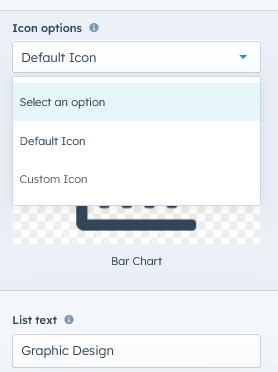
- List Elements: Included "Columns layout", "List style (Dots, Number and Custom & Default icon)".
- Flexibility: The module allows for flexibility in managing dependencies, including the ability to add, remove, or modify dependencies as needed throughout the project lifecycle.
- Interactive Demos: Allow users to interact with the mediatext column flipper through interactive demos.
- Section Background: You can use section background (Solid, Gradient and Background image).
- Smooth Transitions and Animations: Implementation of visually appealing transitions and animations to provide a polished and modern user experience.
- Unlimited Style: Endless customization possibilities for design, allowing users to tailor the interface to their preferences without constraints. Offers flexibility to customize module according to the specific needs and requirements of the project or workflow.
- Cross-Browser Compatibility: Test and ensure compatibility with major browsers to provide a consistent experience. Consider using browser prefixes or polyfills for CSS features if needed.
- Responsive Design: Ensure that the mediatext column module is responsive and compatible with various devices and screen sizes, including desktops, laptops, tablets, and smartphones.
These features collectively provide users with a versatile tool for rearranging and transforming columnar data within media text files, streamlining data processing tasks and enhancing analytical workflows.
Module Setup
Setting up the "MediaText Column Flipper" Module is easy and straightforward. All you have to do is perform a simple drag and drop.
Now let’s go through the setup steps:
- Login to your HubSpot account and left side navigate to the “Content” tab.
- Click on “Content” in the dropdown menu and select “Website Pages” from the extended menu.

- Under the module selection menu, search for “MediaText Column Flipper” and select the module
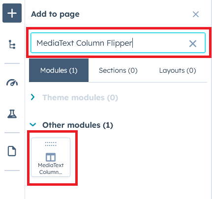
- Now simply pick the "MediaText Column Flipper" module, drag, and drop it wherever you want on your page. You’ll see a new module appear on the page.
Figure 1: Drag and Drop View
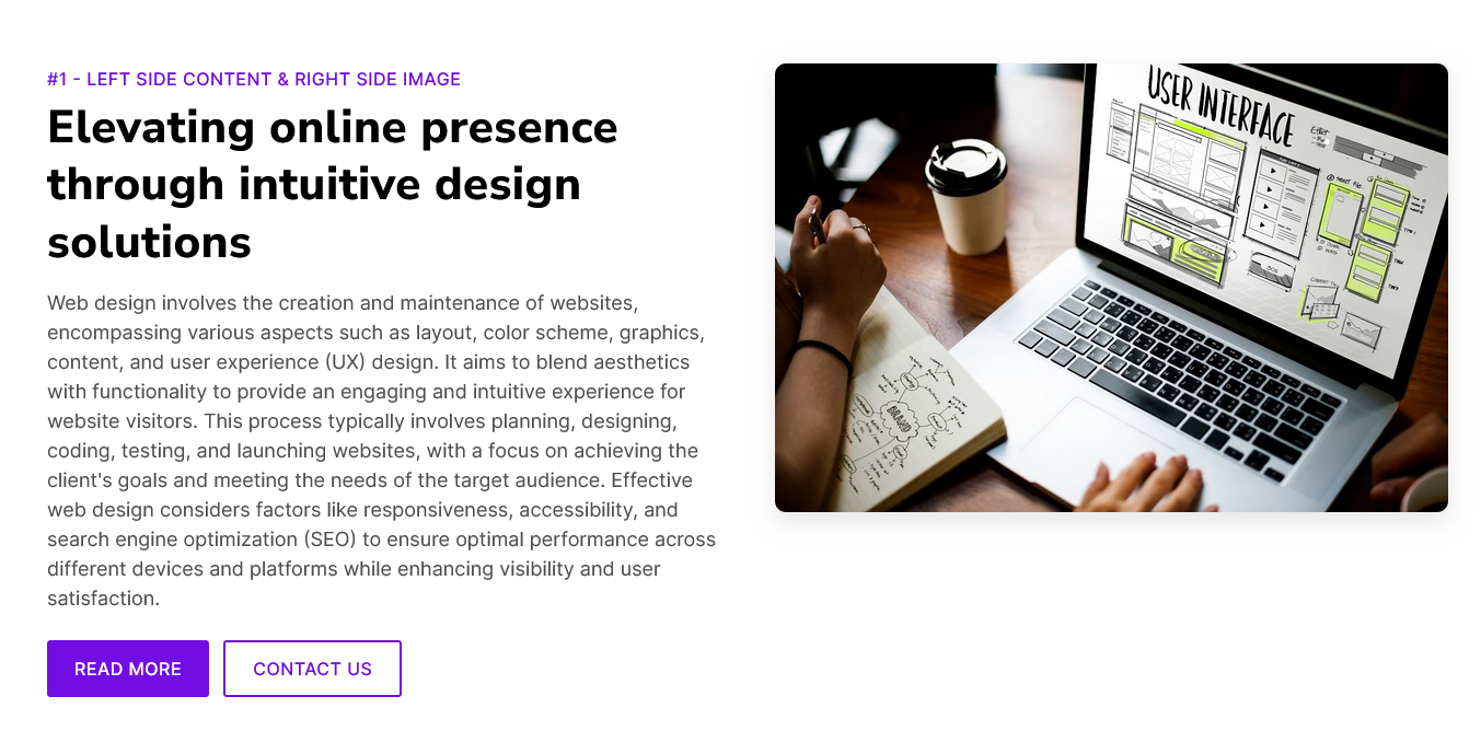
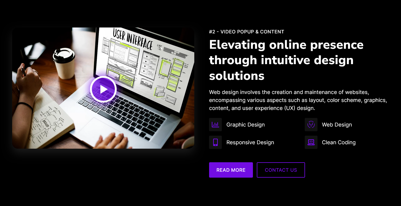
Figure 2: Dark version View
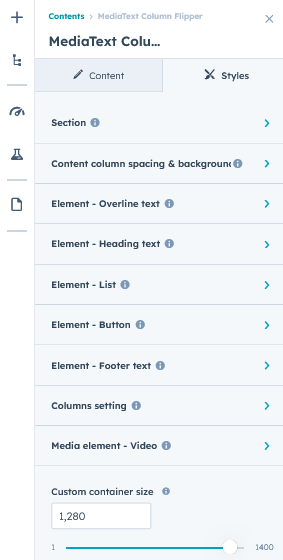
Content Setting
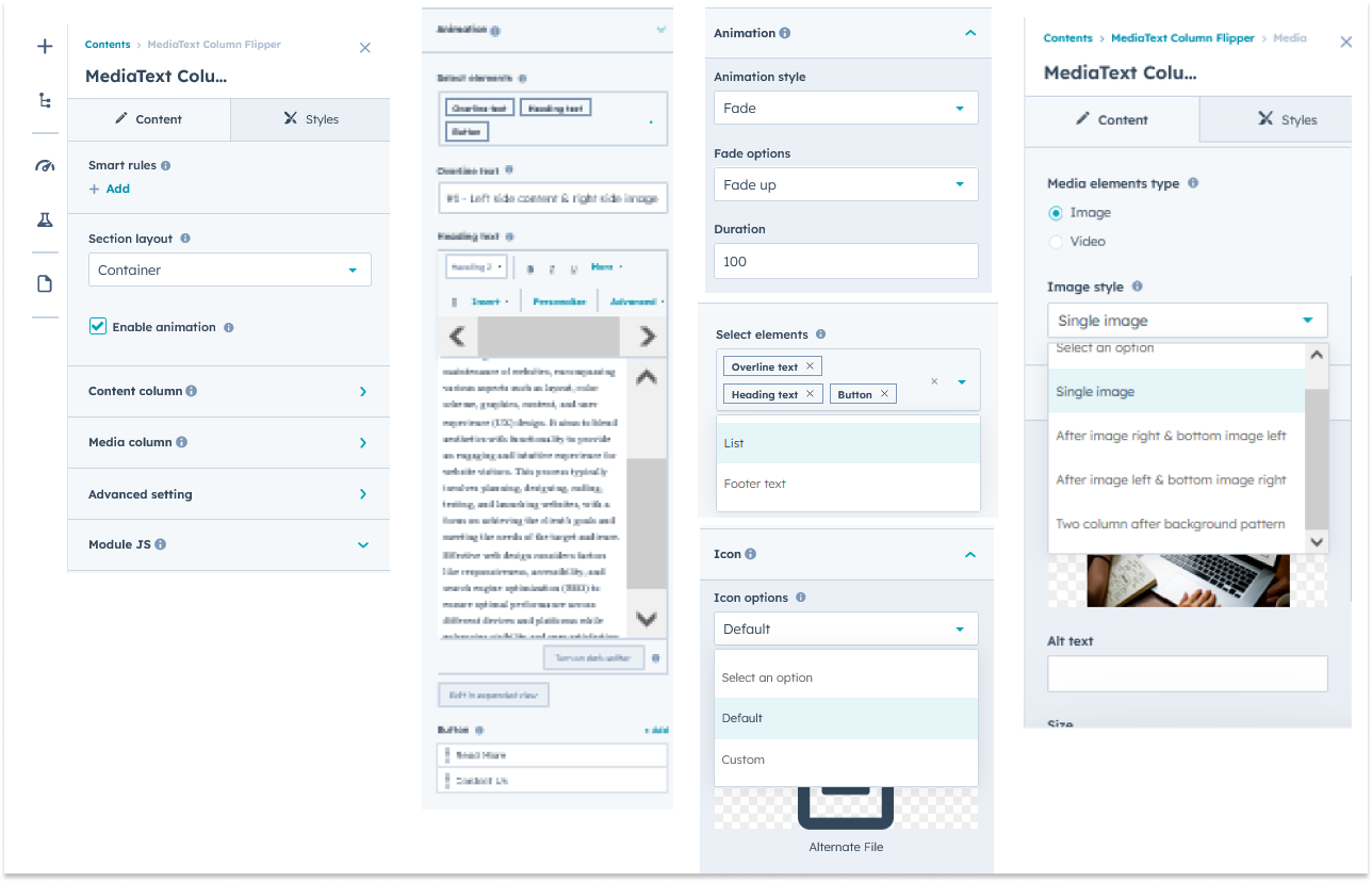
Under “Content”, you can edit the content you want to be easily adjust and update the “Section layout”, "Enable animation", "Content column", "Media column", "Advanced setting", and more as you please.
Below is an overview listing of module content settings:
- Section layout: Section layouts can be set across module levels. Such as "Container" and "Full width".
- Enable animation: Animation of Content column and Media column can be shown/hidden using "Enable animation" field.

- Content column: This content column group information is shown below,
- Animation: Animation included "Fade", "Flip" and "Zoom" options. You can manage the content column animation itself.
- Select elements: You can set the elements order yourself. Elements such as "Overline text", "Heading text", "List Repeater group", "Repeater button" and "Footer text".
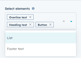
- Overline text: Easily you can do "Edit", "Delete" and "Update" the overline text.
- Heading text: Easily you can do "Edit", "Delete" and "Update" the Heading text.
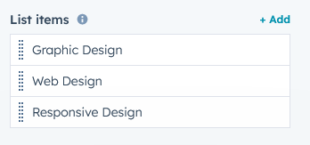
- List column layouts: You can easily change the list repeater item column structure.
- List style: You can customize the list according to your design. Such as "Dots", "Number" and "Icon".
- List items: This group is a repeater group of a list item.
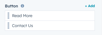
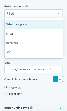
- Button: This group is a repeater group of a button item. You can add as many buttons as you want. You can customize the button according to your design. Button included various style like "Filled", "Bordered" and "Text". You can easily customize button style inline.
- Footer text: Footer text field can be used for important text.
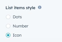
- Media column: This media column group information is shown below,
- Animation: Animation included "Fade", "Flip" and "Zoom" options. You can manage the content column animation itself.
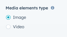
- Media elements type: Two type of media elements type. Such as "Image" and "Video".
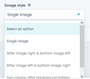
- Image style: Four type of image style, See below screenshot
- Image Wrap: The image field will be seen according to the image style
- Video Wrap: If Media Elements selects a video, the "Video Wrap" group will be available.
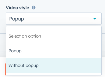
- Video style: Two style of video. Such as "With popup" and "Without popup".
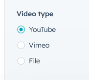
- Video: This group included video format style. Such as "YouTube", "Vimeo" and "File".
- Video style: Two style of video. Such as "With popup" and "Without popup".
- Advanced Setting: This group included the follow field,
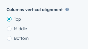
- Columns vertical alignment: You can set columns vertically as "Top", "Middle" and "Bottom". Can be set according to your design.
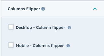
- Columns Flipper: Using this Column Flipper field, you can flip the columns for "Desktop" and "Mobile".
- Columns vertical alignment: You can set columns vertically as "Top", "Middle" and "Bottom". Can be set according to your design.
- Module JS: Include the module level jQuery show/hide field.
Style Setting
- Section: Under section spacing and background to manage module background solid color, background gradient and background image with overlay solid color and gradient. And spacing to easily manage desktop, tablet and mobile padding.

- Content column spacing & background: Content column style you can easily customize such as "Background (Solid, Gradient and Image)", "Border radius", "Border", "Spacing (Desktop, Tablet and Mobile)" and so on.
- Elements - Overline text: Overline text element style you can easily customize such as "Font size", "Font Weight", "Line height", "Letter spacing", "Alignment (Deskotp, Tablet and Mobile)", "Background color(Solid and Gradient)", "Border", "Border radius", "Text Transform" and so on.
- Elements - Heading text: Heading text element style you can easily customize such as "H1 to H6 (Line height)", "Letter spacing", "Alignment (Deskotp, Tablet and Mobile)" and so on.
- Elements - List: List element style you can easily customize such as "Font size", "Font Weight", "Line height", "Letter spacing", "Alignment (Deskotp, Tablet and Mobile)", "Margin bottom", "Icon height", "Icon width", "Icon color", "Icon box background color(Solid and Gradient)", "Column Gap", "Row Gap" and so on."
- Elements - Button: Button element style you can easily customize such as "Margin bottom" and "Alignment (Deskotp, Tablet and Mobile)", "Button spacing (Deskotp, Tablet and Mobile)" and so on.
- Elements - Footer text: Footer text element style you can easily customize such as "Font size", "Font Weight", "Line height", "Letter spacing", "Alignment (Deskotp, Tablet and Mobile)", "Margin bottom" and so on.
- Column setting: Column setting included "Column Gap (Desktop, Tablet and Mobile)."
- Media element - Image: Media element image group included amazing customize options available. Such as "Fancy image style (Border and Background) pattern", "Box shadow", "Border radius", "Border", "Spacing" and on.
- Media element - Video: Media element video group included amazing customize options available. Such as "Box shadow", "Video play button custom style", "Popup custom style", "Spacing" and on.
- Container custom size: Container width to customize the custom container width.
Support
If you have further questions, please reach out to our team at hawksky3012@gmail.com.