Overview
A "Modern Button" module is a reusable component in UI/UX design that allows designers and developers to create consistent, stylized buttons across a website or application. These modules can contain various types of buttons for different user actions, including primary CTAs, secondary actions, and utility buttons. Used for important tasks, like "Learn More", "Add to Wishlist", "Sign Up," "Buy Now," "Submit," "Help", "View Terms". And compact buttons with icons for quick access, commonly used for actions like "Search," "Edit," or "Delete." Provides flexibility for different contexts, with options for colors, sizes, shapes, and effects.
Features Included
Here are key features and effects that you might find in a "Modern Button" module:
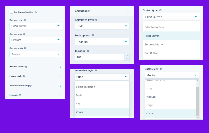
- Button Type: Button types such as "Filled", "Bordered" and "Text" are supported.
- Button Size: Offers various sizes (small, medium, large and Custom) and shapes (rectangular, rounded, pill) for flexible design.
- Button Style: Button style such as "Square", "With Radius", "Rounded", "Top Left and Bottom Right Radius" and "Top Right and Bottom Left Radius" are supported.
- Full Width Button: You can make the button full width on single click.
- Limitless Customization Options: You can make the button full width on single click.
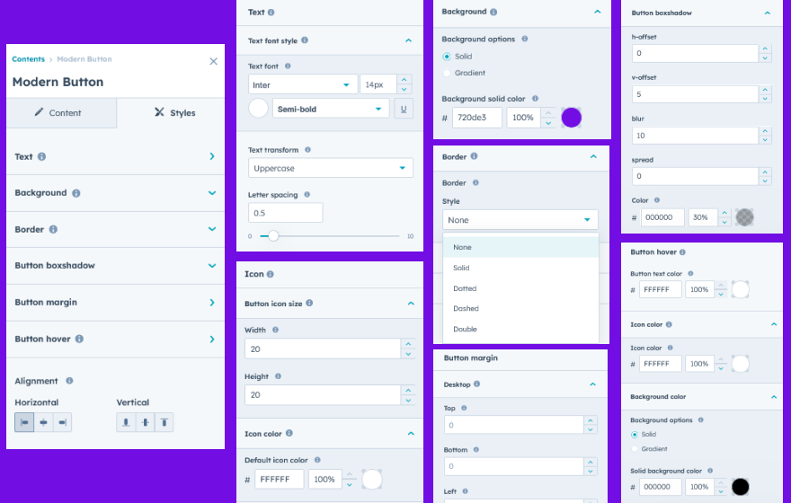
- Color Customization: Allows developers to set background, text, and border colors to align with brand themes.
- Font Styling: Customizable fonts, weights, and sizes to maintain brand consistency.
- Border: You can set border as per requirement and design.
- Border Radius: You can set border radius as per requirement and design.
- Box Shadow: Can set box shadow on startup and hover.
- State Management: Offers various hover state
- Hover State: Changes in color, shadow, or opacity when hovered over to provide visual feedback.
- Background - Hover Effects: Offers various hover effects such as "Basic", "Filled Right side", "Filled Left Side", "Filled Top Side", "Filled Down Side", and "Filled Fade"
- Icon - Show/hide: Icon can be show/hide on button hover.
- Icon and Text Integration: You can use icon (default and custom) with button (Filled, Bordered and Text). Adjust the size and position of icons to ensure they’re well-aligned with any accompanying text. And Position icons on the left and right depending on design needs.
- Interactive Demos: Allow users to interact with the Modern Button through interactive demos. Click here view demo
- Interactive Animations: Smooth transitions between states to create a polished, cohesive feel.
- Padding and Margin Control: Adjustable padding and margin to optimize button layout on different screen sizes.
- Alignment Options: Enables left, right, or center alignment within containers for layout flexibility.
- Responsiveness and Adaptability: Automatically adjusts for mobile, tablet, and desktop views.
These features make Modern Button modules adaptable and powerful, providing flexibility for designers and developers to create interactive, accessible, and responsive button experiences across any platform. This ensures users have a clear, reliable, and visually appealing interface to navigate and engage with.
Module Setup
Setting up the "Modern Button" Module is easy and straightforward. All you have to do is perform a simple drag and drop.
Now let’s go through the setup steps:
- Login to your HubSpot account and left side navigate to the “Content” tab.
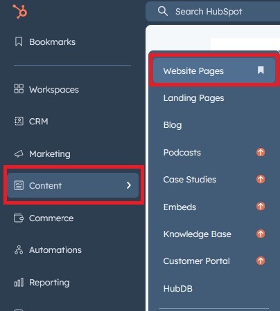
- Click on “Content” in the dropdown menu and select “Website Pages” from the extended menu.
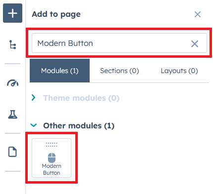
- Under the module selection menu, search for “Modern Button” and select the module
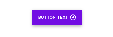
- Now simply pick the "Modern Button" module, drag, and drop it wherever you want on your page. You’ll see a new module appear on the page.
Figure: Drag and Drop View

Support
If you have further questions, please reach out to our team at hawksky3012@gmail.com.