Overview
A "Multi-Purpose Hero Slider" Module is a versatile and dynamic component commonly used in web development and design. It serves as the main visual element at the top of a webpage, typically placed prominently on the homepage. The hero slider's primary purpose is to grab the user's attention, convey important information, and provide a visually appealing introduction to the website.
Features Included
Here's an overview of the key features and purposes of a Multi-Purpose Hero Slider Module:
- Image and Content Rotation: The hero slider displays a series of images or slides that rotate automatically or through user interaction. Each slide often contains a combination of images, text and buttons.
- Video Integration: Hero Sliders allow the incorporation of video content into slides, providing a more dynamic and engaging experience.
- Full-Screen Mode: The ability to expand the slider to full-screen mode for a more immersive experience.
- Scroll Down Button: Scroll down button functionality is also provided in this module.
- Background Overlay: Add a semi-transparent overlay (Solid and Gradient) to the hero banner to improve text readability, especially if your background images and background videos are visually busy.
- Convert Single Hero Banner: If you don't have content in a multiple slide, you can also present content in a single slide without a slider.
- Repeater Buttons: Repeater buttons are used. Such as Filled Button, Bordered Button and Text Button. With hover colors.
- Slider Setting: Autoplay slider, arrows and dots settings can be customized for real desktop, tablet, mobile and small mobile.
- Smooth Animations: Attracts the user's attention, improves the intuitiveness of the user interface, and contributes to a modern and attractive design.
- Performance Optimization: To ensure a smooth user experience, the module may be optimized for performance, taking into account factors such as image compression and lazy loading.
- Responsive Design: A Multi-Purpose Hero Slider Module is often designed to be responsive, ensuring that it looks and functions well across various devices and screen sizes.
- Flexible Functionality: Multi-Purpose Hero Slider modules allow for a high degree of customization. You can modify the appearance, styles, and behavior to match your website and user experience goals. This includes the ability to change color, fonts, alignment, slider setting, vertical full height, scroll down, background color, background image, background gradient, background videos, buttons style, spacing, letter spacing, text transform, hover effects and more.
- Accessibility: Compliance with accessibility standards to ensure that the Hero Slider is usable by individuals with disabilities.
By incorporating these features, Multi-Purpose Hero Slider become powerful tools for conveying information, creating a visually appealing interface, and driving user engagement on a website or web application.
Module Setup
Setting up the "Multi-Purpose Hero Slider" Module is easy and straightforward. All you have to do is perform a simple drag and drop.
Now let’s go through the setup steps:
- Login to your HubSpot account and left side navigate to the “Content” tab.

- Click on “Content” in the dropdown menu and select “Website Pages” from the extended menu.

- Under the module selection menu, search for “Multi-Purpose Hero Slider” and select the module
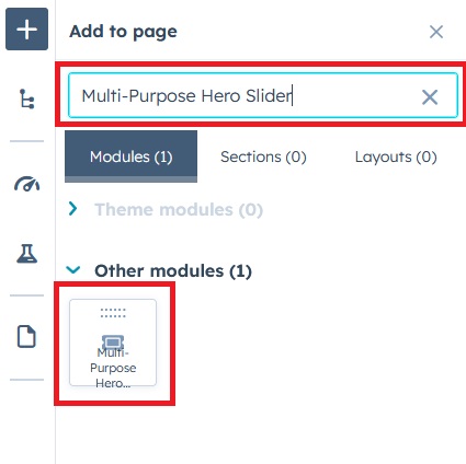
- Now simply pick the "Multi-Purpose Hero Slider" module, drag, and drop it wherever you want on your page. You’ll see a new module appear on the page.
Multi-Purpose Hero Slider Style:
1) Hero Slider with background video:
1.1) Slider left content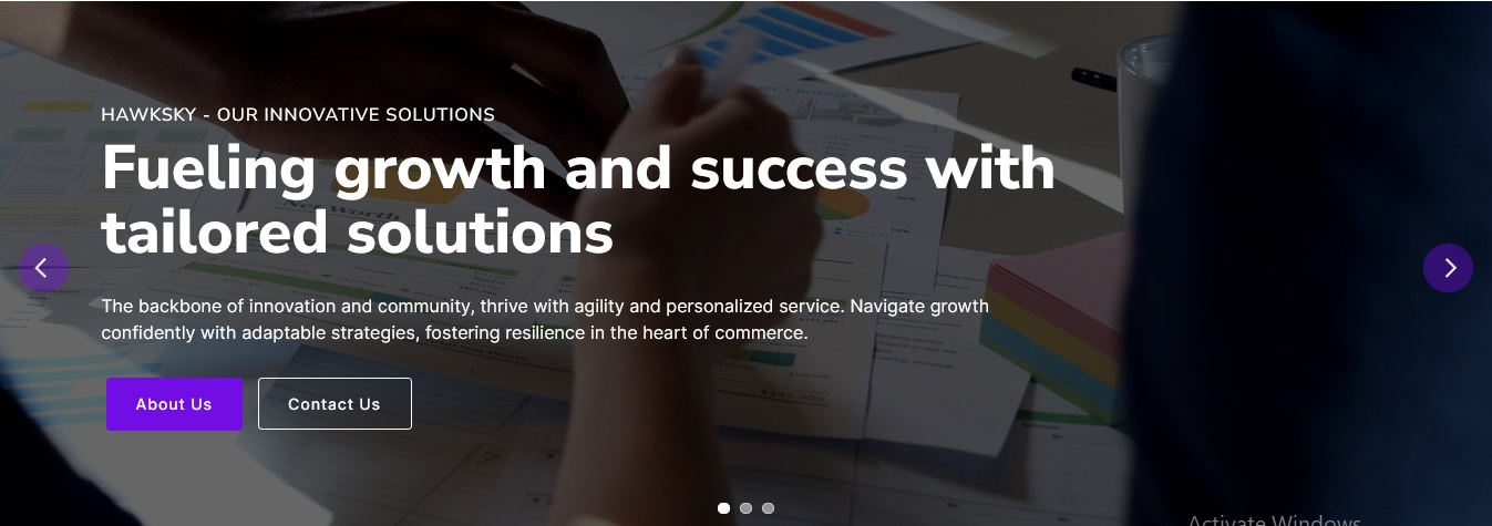


2) Full Screen Hero Banner with Scroll Down Button:

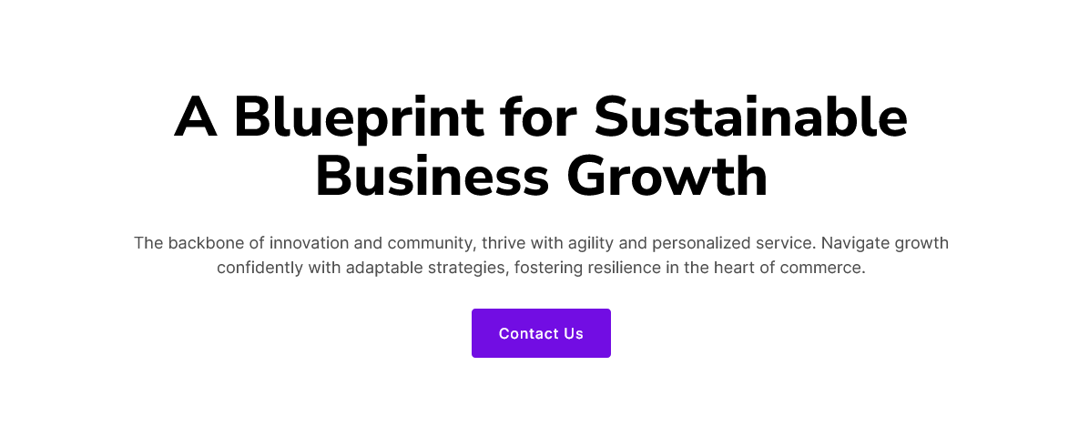
3) Hero Banner with background solid color:
4) Hero Banner with background gradient color:

5) Hero Banner with background video:

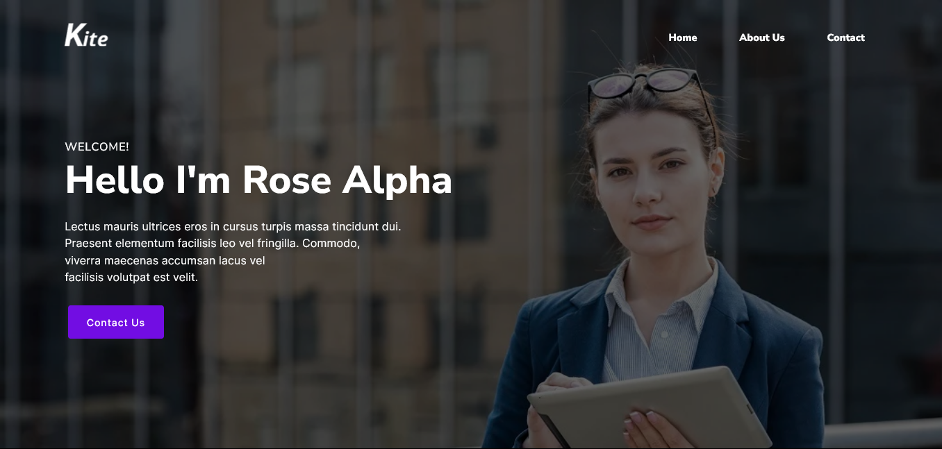
6) About Me Hero Banner:
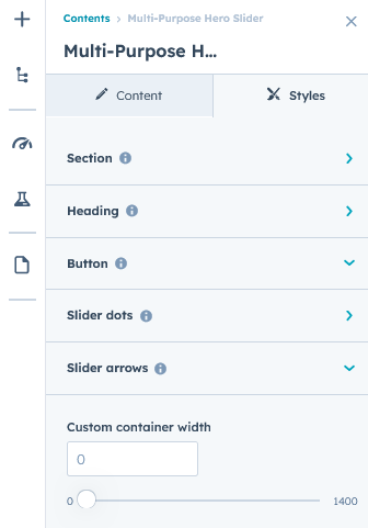
Content Setting
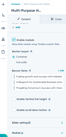
Under “Content”, you can edit the content you want to be displayed on your Multi-Purpose Hero Slider section. Easily adjust and update the “Enable Module”, “Section Layout”, "Banner items", "Overline text", "Heading text", "Buttons", "Slider setting", "Background image", "Background video", "Background solid color", "Background gradient color", "Image overlay (Solid and Gradient color)", "Vertical full height", "Scroll down button", "Inline style" and more as you please.
Below is an overview listing of module content settings:
- Enable module: Module can be shown/hidden.
- Section layout: Section layouts can be set across module levels.
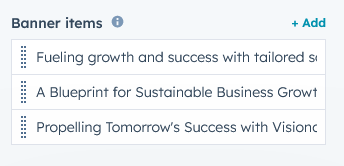
- Banner items: Group of hero banner repeater items.
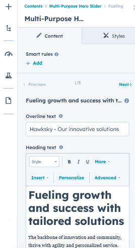
- Overline text: Keyword or highlight text of the section.
- Heading text: Title and description of the section.
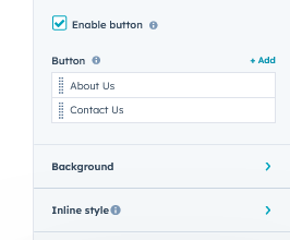
- Enable button: Show/hide repeater buttons.
- Button: Buttons repeater items group.
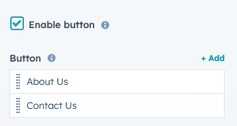
- Button type: Button type such as "Filled", "Bordered" and "Text".
- Button text: This is a button text field. You can update the button text.
- Button link: This is a button link field. You can update the button link. Such as "External" and "Content".
- Inline button style: Inline button style to manage the button style. Such as "Button font", "Button size", "Button text font", "Button text font weight", "Button background color", "Button border color", "Button hover text color", "Button hover background color" and "Button hover border color".
- Background: This is a group of slider background types.
- Background type: Slider background type such as "Solid", "Gradient", "Image" and "Video".
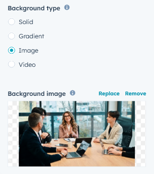
- Overlay: "Background image" and "Background video" solid and gradient overlay color style group.
- Background type: Slider background type such as "Solid", "Gradient", "Image" and "Video".
- Inline style: Slider content and overline text inline style group.
- Content: Content included the "Width" and "Alignment". Which helps to design slider content.
- Overline text: Inline, change the overline text color.
- Enable vertical full height: The ability to expand the slider to full-screen mode for a more immersive experience.
- Enable slider down button: Scrolls smoothly on button click and goes to the following section.
- Slider setting: Autoplay slider, slider animation, slider custom speed, arrows and dots settings can be customized for real desktop, tablet, mobile and small mobile.
- Module JS: This is the group of the module level JS
- Enable jQuery JS: If you already use jQuery JS, then disable JS. Because same JS not required multiple time.
- Enable slick slider JS: If you already use slick slider JS, then disable JS. Because same JS not required multiple time.
Style Setting
- Section: Slider spacing can be customized using spacing field. Such as desktop, tablet and mobile.
- Heading: Easy customize the line height, text transform and font weight and Heading alignment and spacing.

- Button: Customize the letter spacing, and tablet font size, mobile font size and text transform (Uppercase, Lowercase, Capitalize and None).
- Slider dots: Included the slider dots style.
- Background color: Background color to slider Dots background color can be changed.
- Border color: Border color to slider dots background color can be changed.
- Active dots: Active dots border color and background color can be changed.
- Slider arrows: Included the slider arrows style.
- Arrows color: Arrows color to slider arrows color can be changed.
- Arrows background color: Arrows background color to slider arrows background color can be changed.
- Hover icon color: The icon color can be changed to hover over the slider arrows.
- Hover background color: The background color can be changed to hover over the slider arrows.
- Container custom size: Container width to customize the custom container width.
Support
If you have further questions, please reach out to our team at hawksky3012@gmail.com.