
Overview
The "Pricing with Slider" module is designed to provide users with a clean, transparent pricing experience. It supports interactive inputs such as dynamic user tiers via a range slider and duration switching via a stylized toggle button. It leverages HubSpot's structured style fields to allow complete design flexibility directly from the page editor without modifying the source code.
Features Included
Here are some key features and effects that you might find in a portfolio with "Pricing with Slider" module:
- Dynamic User-Based Pricing: Automatically adjusts plan pricing based on the number of users selected through the slider. This provides instant cost visibility and helps customers choose the most suitable plan for their team size.
- Interactive User Slider (Optional): Enable an interactive user slider to let customers adjust the number of users effortlessly. When enabled, pricing updates dynamically based on the selected user count in real time. This optional feature adds flexibility and enhances the overall pricing experience.
- Monthly & Yearly Billing Toggle: Users can switch between monthly and yearly billing options with a single click. The pricing updates instantly, making it easy to compare costs and savings.
- Real-Time Price Updates: All plan prices are recalculated dynamically without page refreshes. This ensures a fast, modern, and user-friendly pricing experience.
- Advanced Grid Gaps & Spacing Controls: Fine-tune the spacing between pricing cards and content with advanced grid gap controls. Adjust horizontal and vertical spacing to achieve a clean, balanced, and professional layout. Provides complete flexibility to create a perfectly aligned pricing section across all screen sizes.
- Recommended Plan Highlight (Optional): Highlight the most recommended or popular pricing plan to capture user attention. This helps users quickly identify the best-value option and encourages higher conversions. Enable this optional feature to create a more engaging and conversion-focused pricing experience.
- Flexible Feature List Styles: Display plan features using multiple list styles, including Icons, Dots, Numbers, Square, Circle, Line, Alphabetical (A, B, C / a, b, c), Upper Roman (I, II, III), and Lower Roman (i, ii, iii) and so on.
Choose the list style that best matches your website's design and branding. This flexibility improves readability while creating a clean and professional pricing layout. - Badge Highlight: Display eye-catching badges such as Most Popular, Best Value, or Recommended to highlight featured pricing plans. Badges help users quickly identify the best option and improve decision-making. They also increase visibility and encourage higher conversion rates.
- Interactive Demos: Allow users to explore Pricing with Slider through interactive demos. [Click here to view the demo].
- Fully Responsive Design: The pricing module is optimized for desktops, tablets, and mobile devices. Users enjoy a consistent and intuitive experience across all screen sizes.
- Customizable Pricing Plans: Plan names, features, pricing, and call-to-action buttons can be easily customized. This flexibility allows businesses to adapt the module to their specific needs.
- Clean & Modern User Interface: Designed with a professional layout and modern visual elements to enhance user engagement. The intuitive structure makes plan comparison quick and effortless.
- Animation/Transition: Smooth animations and seamless transitions enhance the overall user experience. Interactive effects make pricing updates feel natural, responsive, and visually engaging.
- Limitless Customization & Styling: Customize every aspect of the pricing section to match your brand identity and design preferences. Easily modify colors, typography, layouts, spacing, buttons, and pricing cards without limitations. Create a unique, professional, and visually appealing pricing experience with complete design flexibility.
By combining these powerful Pricing with Slider features, businesses can deliver a seamless and interactive pricing experience. Users can easily adjust the slider, compare plans, and view real-time pricing updates based on their requirements. The module enhances user engagement, simplifies decision-making, and creates a modern, conversion-focused pricing section. This results in a more intuitive, transparent, and effective subscription experience for every customer.
Setting up the "Pricing with Slider" Module is easy and straightforward. All you have to do is perform a simple drag and drop.
Now let’s go through the setup steps:
- Login to your HubSpot account and left side navigate to the “Content” tab.
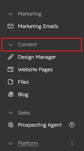
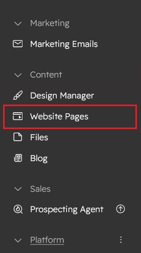
- Click on “Content” in the dropdown menu and select “Website Pages” from the extended menu.
- Under the module selection menu, search for “Pricing with Slider” and select the module
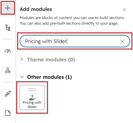
- Now simply pick the "Pricing with Slider" module, drag, and drop it wherever you want on your page. You’ll see a new module appear on the page.

Content Setting

- Section title: Enter the main heading displayed at the top of the pricing section.
- Subtitle: Add a short description below the section title to provide additional information.
- Monthly button: Customize the label for the monthly billing toggle.
- Yearly button: Customize the label for the yearly billing toggle.
- Slider min: Set the minimum number of users that can be selected using the pricing slider.
- Slider max: Set the maximum number of users available on the pricing slider.
- Slider default: Specify the default slider value when the pricing section loads.
- Currency symbol: Enter the currency symbol to display before all pricing values (e.g., $, €, £, ₹).
- Pricing plans: Add multiple pricing plans using a repeater and customize each plan independently. Easily manage plan names, pricing, features, badges, and button settings from a single interface.
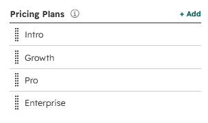
- Active plan: Enable this option to display the selected highlight pricing plan.
- Badge: Enter a custom badge label such as Most Popular, Recommended, or Best Value.
- Plan name: Specify the title of the pricing plan.
- featured plan: Highlight the selected plan to make it stand out visually from the other plans.
- Description: Provide a brief summary describing the purpose or benefits of the pricing plan.
- Monthly price: Enter the monthly subscription price for the selected plan.
- Yearly price: Enter the yearly subscription price for the selected plan.
- Features: Add, remove, and reorder plan features. Each feature will be displayed inside the pricing card.

- Button text: Customize the call-to-action button label.
- Button link: Choose where the button should redirect users.
- Advanced Settings: Configure additional layout and display options to customize the pricing section according to your website's requirements.
- Section layout: Choose the layout type for the pricing section, such as "Container" or "Full Width".
- Section class: Add custom CSS classes for advanced styling.
- Section ID: Assign a unique HTML ID for navigation or custom JavaScript.
- Pricing discount: Set the yearly discount percentage. The discounted yearly pricing will be calculated automatically.
- Badge position: Choose the display position of the pricing badge. Such as "Left side", "Right side" and "Center".
- Show / Hide Slider: Enable or disable the user pricing slider based on your requirements.
- Slider Settings: Slider Steps - Specify the increment value for the pricing slider.
- Features Listing: Display Options - Choose how pricing features are displayed. Supported options include: "Icon", "Dots (Bullets)", "Numbers", "Upper Alphabet (A, B, C)", "Lower Alphabet (a, b, c)", "Upper Roman (I, II, III)", "Lower Roman (i, ii, iii)".
- Alignment: Choose the alignment for the pricing section content, such as "Left", "Center", or "Right". This helps you create a balanced and visually appealing layout that matches your website's design.
- Hover – plan grid: Enable hover effects on pricing cards to improve user interaction and highlight the selected plan.
- Hover – Smooth transition effect: Adds smooth animations and transition effects when users hover over pricing cards, creating a more polished and modern experience.
- Load jQuery from CDN: Enable this option to load the jQuery library from an external CDN at the module level. Disable it if your website already loads jQuery to avoid duplicate loading and potential conflicts.
Style Setting

- Section: Under section spacing and background to manage module background solid color, background gradient and background image with overlay solid color and gradient. And spacing to easily manage desktop, tablet and mobile padding.

- Section title: Customize the appearance of the section title by selecting the font family, font size, text color, font weight, text transform (uppercase, lowercase, capitalize, or none), and letter spacing. You can also set separate font sizes for tablet and mobile devices to ensure consistent readability across all screen sizes.
- Section subtitle: Style the section subtitle by choosing the font family, font size, text color, and font weight. Additionally, configure separate subtitle font sizes for tablet and mobile devices to maintain a responsive and visually balanced layout on every device.
- Toggle button block: Configure the toggle button block by setting the solid background color, border style, border color, and border width. These options help you create a visually distinct and well-defined container for the toggle buttons.
- Button spacing: Adjust the spacing around toggle buttons by configuring margins and padding for desktop, tablet, and mobile devices.
- Toggle buttons – Spacing bottom: Control the bottom spacing below the toggle buttons for desktop, tablet, and mobile devices. This helps maintain proper alignment and consistent vertical spacing between the toggle buttons and the content that follows.
- Active button: Customize the appearance of the active toggle button by setting its text color and background color. These styling options help highlight the selected button and improve the overall user experience.
- User slider: Adjust the width of the user slider to control how much horizontal space it occupies within the module. Use the slider or input field to set the desired width for the layout.
- Tooltip: Customize the tooltip appearance by selecting the font family, font size, text color, font weight, border radius, and background color. These options help create tooltips that match your website's overall design and improve readability.
- Slider labels: Style the slider labels by configuring the font family, font size, text color, and font weight. These settings ensure the slider labels are clear, readable, and visually consistent with the rest of the module.
- Slider track line: Customize the slider track by setting the default track color, track line border radius, left-side filled track color, and right-side unfilled track color. These styling options allow you to create a visually appealing and responsive slider.
- Track line – Circle: Configure the slider handle (circle) by setting its background color and border color. These options help make the slider thumb more visible and align it with your overall design style.
- Spacing bottom: Set the bottom spacing for desktop, tablet, and mobile devices independently. This ensures consistent vertical spacing below the slider across different screen sizes and improves the overall layout responsiveness.
- Plan items: Customize the styling of individual pricing plan elements, including the title, badge, pricing, plan description, pricing period, features listing, and button. Each section provides dedicated styling options to help you create a visually consistent and engaging pricing table that matches your website's design.
- Title: Customize the title appearance by selecting the font family, font size, text color, font weight and letter spacing. You can also set separate font sizes for tablet and mobile devices to ensure a responsive, consistent, and visually balanced design across all screen sizes.
- Badge: Customize the badge appearance by configuring the font family, font size, text color, font weight, background color, and border color. You can also set separate font sizes for tablet and mobile devices to ensure a responsive, consistent, and visually balanced design across all screen sizes.
- Pricing: Customize the pricing appearance by selecting the font family, font size, text color and font weight. You can also set separate font sizes for tablet and mobile devices to ensure a responsive, consistent, and visually balanced design across all screen sizes.
- Plan description: Customize the plan description appearance by selecting the font family, font size, text color, font weight and line height. You can also set separate font sizes for tablet and mobile devices to ensure a responsive, consistent, and visually balanced design across all screen sizes.
- Pricing period: Customize the pricing period appearance by selecting the font family, font size, text color and font weight. You can also set separate font sizes for tablet and mobile devices to ensure a responsive, consistent, and visually balanced design across all screen sizes.
- Features listing: Customize the appearance of the features listing by configuring the font family, font size, text color, font weight, icon size, icon or symbol color, and spacing. You can also define separate font sizes for tablet and mobile devices to ensure a responsive, consistent, and visually balanced design across all screen sizes.
- Button: Customize every aspect of your button design with ease, including the font family, font size, text color, font weight, letter spacing, border color, background color (solid or gradient), hover colors, active-state spacing, and hover styles. You can also define separate font sizes for tablet and mobile devices to ensure a responsive, consistent, and visually balanced design across all screen sizes. These flexible styling options make it simple to create responsive, visually consistent, and engaging buttons that match your website’s branding.
- Plan grid: Customize the appearance of the pricing plan grid by configuring the background color (solid or gradient), border color, border radius, inner spacing (padding), outer spacing (margin), and optional box shadow. You can also define separate spacing values for desktop, tablet, and mobile devices to create a responsive, visually balanced, and professional layout across all screen sizes.
- Active plan grid: Customize the appearance of the active (highlighted) pricing plan by configuring the text color, border color, background color, and optional box shadow. These styling options allow you to visually emphasize the featured plan and make it stand out while maintaining a consistent design that matches your website's branding.
- Hover - Plan grid: Customize the appearance of the pricing plan on hover by configuring the text color, border color, background color, and optional box shadow. These styling options allow you to create engaging hover effects that enhance user interaction while maintaining a consistent and visually appealing design across your pricing table.
- Section container size: Control the overall width and maximum width of the section container to define how the pricing module is displayed within the page layout. These settings help create a responsive, well-aligned, and visually balanced design across desktop, tablet, and mobile devices.

Support
If you have further questions, please reach out to our team at hawksky3012@gmail.com.