
Overview
The "Services Carousel" Module is a modern, interactive showcase component designed to help users discover and explore your services effortlessly. It presents each service with a clear image, title, and short description, making information easy to understand at a glance. Its responsive design ensures a seamless browsing experience across desktop, tablet, and mobile devices. Simple navigation allows users to scroll through services smoothly and find what they need quickly. By combining an engaging layout with intuitive usability, this module enhances user engagement while showcasing your services in a visually appealing and professional manner.
Features Included
Here are some key features and effects that you might find in a portfolio with "Services Carousel" module:
- Interactive Service Showcase: Display services in an engaging, swipeable carousel for an enhanced browsing experience.
- Rich Service Cards: Showcase each service with an image, title, short description, and call-to-action button.
- Easy Navigation: Navigate services effortlessly using arrows, swipe gestures, or pagination controls.
- Customizable Content: Easily update service details, images, links, and display order without code changes.
- Flexible Layout: Supports multiple card styles and carousel configurations to match your website design.
- Responsive Design: Delivers a seamless and consistent experience across desktop, tablet, and mobile devices.
- Interactive Demos: Allow users to explore Services Carousel through interactive demos. [Click here to view the demo].
- Fast Loading Performance: Optimized for smooth scrolling and quick page loading across devices.
- Scalable & Reusable Component: Easily integrate the module into multiple pages for a consistent service presentation.
- Clean & Modern User Interface: Provides a clean, intuitive, and visually appealing interface that enhances the user experience while making services easy to browse and explore.
- Smooth Animations & Transitions: Delivers smooth animations and seamless transitions between service cards, creating an engaging and interactive browsing experience.
- Limitless Customization & Styling: Easily customize layouts, colors, typography, spacing, and carousel settings to match your brand identity and design requirements without compromising flexibility.
These feature titles are suitable for premium product pages, documentation, or company websites and make the Services Carousel Module sound more professional and appealing.
Setting up the "Services Carousel" Module is easy and straightforward. All you have to do is perform a simple drag and drop.
Now let’s go through the setup steps:
- Login to your HubSpot account and left side navigate to the “Content” tab.
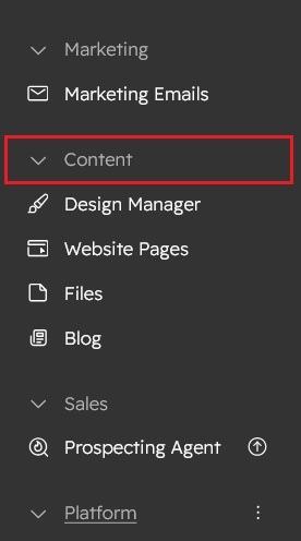
- Click on “Content” in the dropdown menu and select “Website Pages” from the extended menu.

- Under the module selection menu, search for “Services Carousel” and select the module
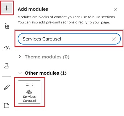
- Now simply pick the "Services Carousel" module, drag, and drop it wherever you want on your page. You’ll see a new module appear on the page.

Content Setting
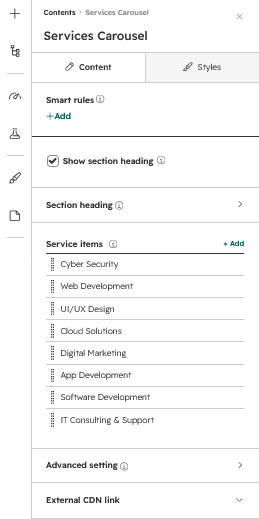
1. Show Section Heading:
Enable or disable the complete section heading.
| Field | Description |
|---|---|
| Show Section Heading | Displays or hides the section heading area. |
| Field | Description |
|---|---|
| Overline Text | Small heading displayed above the main title. |
| Title | Main section heading. Supports HTML line breaks (<br>). |
| Subtitle | Displays supporting text below the title. |
| Description | Displays additional descriptive content. |
| Field | Description |
|---|---|
| Button Type | Select Filled, Bordered, or Text Button. |
| Button Text | Button label displayed to visitors. |
| Link To | Select the destination type. |
| URL | Destination URL. |
| Open Link in New Tab | Opens the button link in a new browser tab. |
2. Service items: (Repeater Group)

Add and manage multiple service cards using the repeater group. Each item includes a custom icon, title, short description, featured image, and optional details link, allowing you to create a fully customizable and scalable services carousel.
| Field | Description |
|---|---|
| Service Icon Type |
Select Default Icon or upload a Custom Icon. |
| Default Icon |
Use default hubspot icons |
| Custom Icon | Upload SVG, PNG, or supported image format. |
| Title | Service title displayed on the card. |
| Short Description | Brief description of the service. |
| Card Image | Featured image for the service card. |
| Field | Description |
|---|---|
| Link To | Select the destination type. |
| URL | Enter the service details page URL. |
| Open Link in New Tab | Opens the service page in a new browser tab. |
3. Advanced Settings:
| Field | Description |
|---|---|
| Section Class | Add a custom CSS class. |
| Section ID | Add a unique HTML ID. |
Configure the layout and alignment of the section heading to match your website design across different screen sizes.
| Field | Description |
|---|---|
| Section Heading Display Type | Choose how the section heading is displayed: With Column displays the heading and description in separate columns, while Without Column displays all heading content in a single column. |
| Desktop Alignment | Set the heading content alignment for desktop devices. Available options are Left, Center, and Right. |
| Tablet Alignment | Set the heading content alignment for tablet devices. Available options are Left, Center, and Right. |
| Mobile Alignment | Set the heading content alignment for mobile devices. Available options are Left, Center, and Right. |
| Field | Description |
|---|---|
| Cards Box Shadow | Enable or disable card shadows. |
| Desktop Spacing | Controls spacing between cards on desktop. |
| Tablet Spacing | Controls spacing between cards on tablet. |
| Mobile Spacing | Controls spacing between cards on mobile. |
| Field | Description |
|---|---|
| Dots | Display pagination dots. |
| Arrows | Enable Previous and Next navigation arrows. |
| Tablet Controls | Configure navigation for tablet devices. |
| Mobile Controls | Configure navigation for mobile devices. |
4. External CDN:
| Library | Description |
|---|---|
| Font Awesome | Loads Font Awesome icons. |
| Slick Slider | Loads the Slick Slider library. |
| Load jQuery CDN | Loads jQuery if unavailable. |
Style Setting

Module Style:
Customize the appearance of the Services Carousel Module by configuring the section background, spacing, icon style and typography. These settings help maintain consistent branding and responsive layouts across all devices.
1. Section:
Customize the section background with solid colors, gradients, images, or image overlay colors. You can also adjust spacing separately for desktop, tablet, and mobile to match your design perfectly.
Section Background:| Field | Description |
|---|---|
| Background Type | Select the section background style. Supported options include Solid Color, Gradient, Image, and other available image background overlay (Solid and Gradient). |
| Solid - Background Color | Choose a solid background color to create a clean and consistent section design. |
| Gradient - Background Color | Create a smooth and attractive background using customizable gradient colors. |
| Background image | Enhance your background image with customizable solid or gradient overlay colors for a polished look. |
| Field | Description |
|---|---|
| Desktop Spacing | Configure top and bottom margins along with padding values for desktop devices. |
| Tablet Spacing | Adjust margins and padding to create an optimized layout on tablet screens. |
| Mobile Spacing | Define responsive spacing for mobile devices to ensure a clean and consistent layout. |
2. Section Heading:
| Field | Description |
|---|---|
| Overline text | Customize the overline text with typography, font weight, color, line height, letter spacing, text transform, background color, and spacing. You can also adjust font sizes separately for desktop, tablet, and mobile devices. |
| Title | Customize the title with typography, font weight, color, line height, letter spacing, text transform, bottom spacing and responsive font sizes for desktop, tablet, and mobile. |
| Subtitle | Customize the Subtitle with typography, font weight, color, line height, letter spacing, bottom spacing and responsive font sizes for desktop, tablet, and mobile. |
| Description | Customize the description with typography, font weight, color, line height, letter spacing, bottom spacing and responsive font sizes for desktop, tablet, and mobile. |
| Button | Customize the button with typography, font weight, color, letter spacing, line height, text transform, solid or gradient background, border color, hover colors, button size, and bottom spacing. You can also adjust responsive font sizes for desktop, tablet, and mobile devices. |
3. Service card:
| Field | Description |
|---|---|
| Icon | Adjust the icon's size, color, spacing, and responsive styling to match your design. |
| Servies Title | Customize the cards title with typography, font weight, color, line height, letter spacing, text transform, bottom spacing and responsive font sizes for desktop, tablet, and mobile. |
| Popupbox | Customize the popup box with an icon style, title style, and description style. You can also personalize the background using solid or gradient colors, along with border radius and inner spacing to match your design. |
| Cards style | Customize the card style with solid or gradient background overlay colors and adjust the border radius to match your design. |
4. Slider navigation:
| Field | Description |
|---|---|
| Arrow buttons | Customize the slider navigation arrows with size, color, background, border, border radius, and hover effects to match your design. |
| Dots | Customize the slider navigation dots with size, color, spacing, active state, and hover effects to match your design. |
5. Section container size:
| Field | Description |
|---|---|
| Container size | Customize the section container width to control the content layout and match your design requirements. |
Support
If you have further questions, please reach out to our team at hawksky3012@gmail.com.