Overview
The "Simplify Accordion" module in the HubSpot allows you to user interface (UI) component often used in web design and development to organize and display content in a compact and organized manner. It is particularly useful for presenting information in a structured way while conserving screen real estate. The accordion module typically consists of a series of collapsible panels or sections, where only one panel is expanded (visible) at a time, and the others are collapsed (hidden). Users can click or interact with the panels to expand or collapse them, revealing or hiding the content within.
Features Included
Here are some common features and effects that you might find in a simplify accordion module:
- Flexible Functionality: Simplify accordion modules allow for a high degree of customization. You can modify the appearance, styles, and behavior to match your website or application's design and user experience goals. This includes the ability to change title icons, arrow icons, colors, fonts, animations, and more.
- Panels/Sections: The primary building blocks of the accordion module are the individual panels or sections. Each panel represents a distinct category, topic, or piece of content. These panels are stacked vertically or horizontally, depending on the various design.
- Headers/Titles: Each panel has a header or title that serves as a label for the content it contains. When users click on a panel's header, it typically triggers the panel to expand or collapse. Headers are often styled differently from the panel's content to make them stand out.
- Content: The content area is the part of the panel that is hidden or revealed when the panel is expanded or collapsed. This content can include text, images, forms, or other types of information.
- Expand/Collapse Interaction: Users can interact with the accordion module by clicking on the headers or using other input methods to expand or collapse the panels. Only one panel is typically open at a time, so when a user expands one panel, any open panels will automatically collapse.
- Animation/Transition: Smooth animations or transitions are often used to visually convey the opening and closing of panels, providing a better user experience.
-
Accessibility: It's important to ensure that accordion modules are designed with accessibility in mind.
- Customization: Accordion modules can be customized in terms of style, layout, and behavior to match the overall design of a website or application. This may include choosing the orientation colors, icons, and other design elements.
- Responsive: Accordion modules can be fully desktop and mobile friendly component.
Accordions are a versatile and practical UI element for improving the organization and presentation of content on websites. They help users focus on the information they are interested in while reducing clutter and the need for excessive scrolling.
Module Setup
Setting up the "Simplify Accordion" Module is easy and straightforward. All you have to do is perform a simple drag and drop.
Now let’s go through the setup steps:
- Login to your HubSpot account and left side navigate to the “Content” tab.

- Click on “Content” in the dropdown menu and select “Website Pages” from the extended menu.

- Under the module selection menu, search for “Simplify Accordion” and select the module

- Now simply pick the "Simplify Accordion" module, drag, and drop it wherever you want on your page. You’ll see a new module appear on the page.
Easily customizable accordion demo style:
-
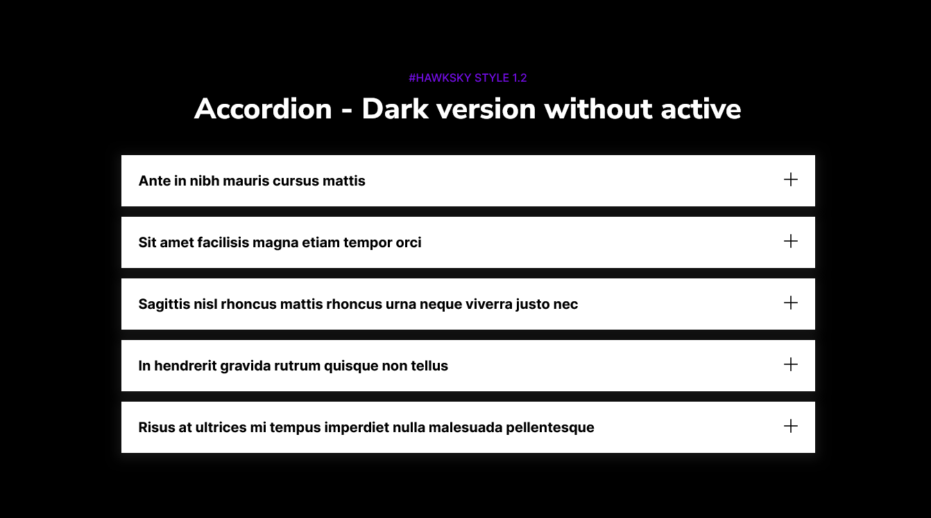
Style 1: Accordion - Dark version without active
-
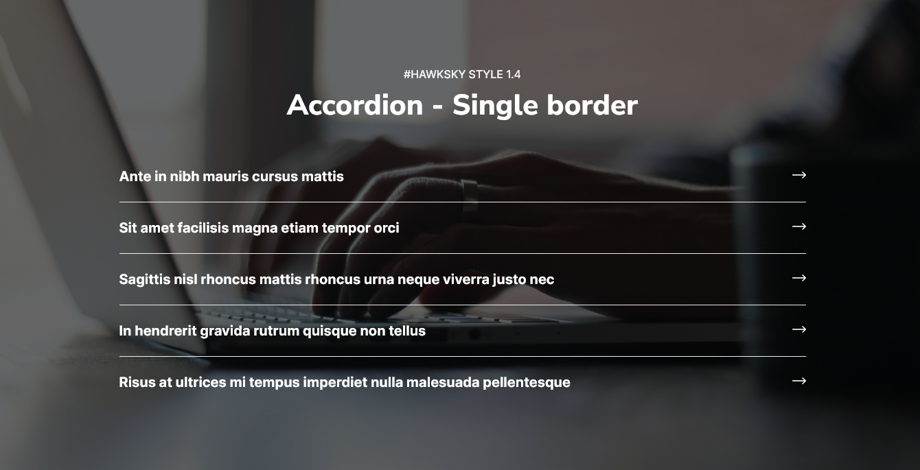
Style 2: Accordion - Single border with background image
-
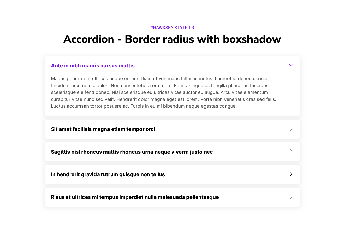
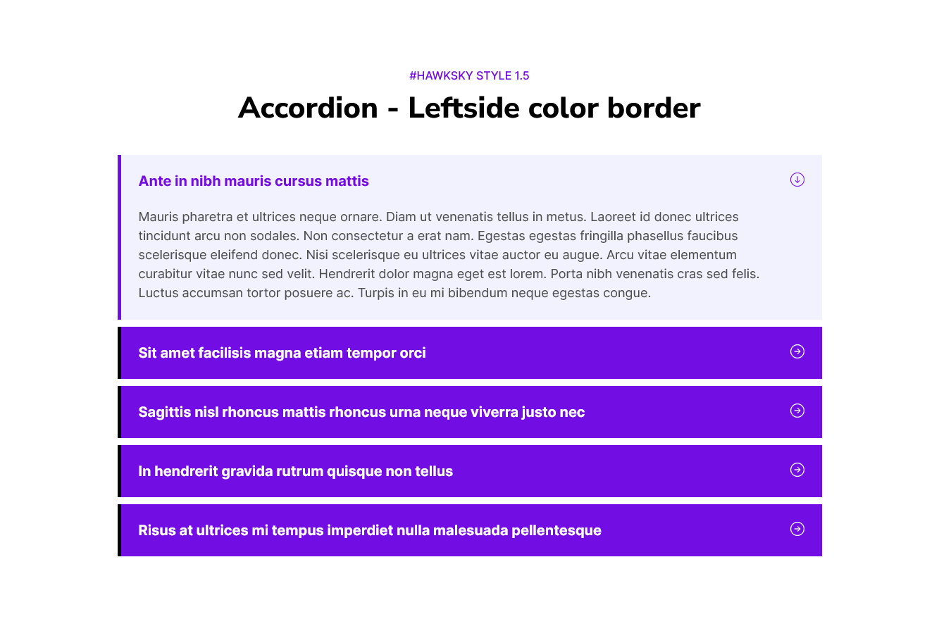
Style 3: Accordion - Left side color border
-
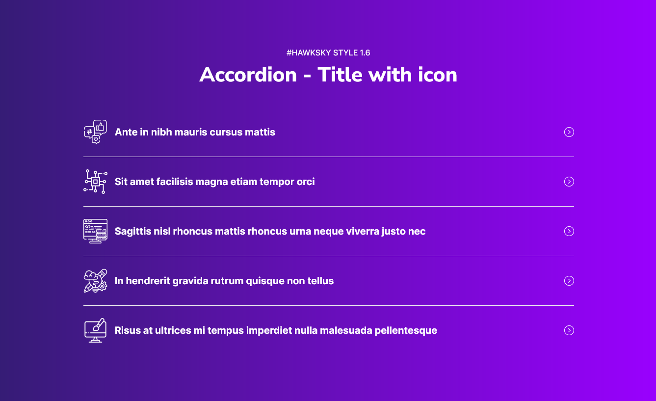
Style 4: Accordion - Title with icon and section gradient background
-
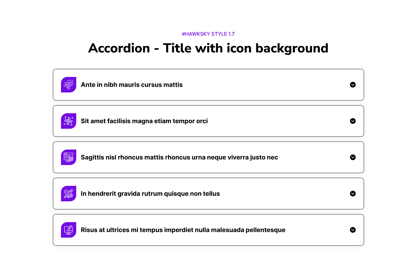
Style 5: Accordion - Title with icon background
Content Setting

Under “Content”, you can edit the content you want to be displayed on your Accordion with multiple anatomy section. Easily adjust and update the “Enable Module”, “Layout”, "Enable heading", "Heading animation", "Accordion group", "Accordion items", "Accordion title with icon option", "Enable active accordion", "Accordion arrow" and more as you please.
- Heading dropdown: Heading dropdown include the "Enable animation", "Animation group" "Overline text" and "Copy text".
-
Figure 1: Animation group - Include the Animation style like 1) Fade 2) Flip and 3) Zoom

-
Figure 2: Overline text, Copy text

-
- Accordion dropdown: Include the field "Enable active" and "Repeater field".
-
Figure 1: Repeater field - Include the "Title", "Description text" and "Title icon" and more. You can do add as much as you like.


- Figure 2: Title with icon - You can use any icon you like (Custom and default icon)


-
Figure 3: Enable animation - Include the field like "Animation style", "Style option" and "Duration"

-
- Accordion arrow: Accordion arrow group into the two option available like
1) Open state icon: Use the open state icon when the accordion item is active

2) Close state icon: Use the close state icon when the accordion item is inactive

Style Setting

- Section: Under section spacing and background to manage module background solid color, background gradient and background image with overlay solid color and gradient. And spacing to easily manage desktop, tablet and mobile padding.
- Heading: Easy customize the overline text typography font, color, line height, text transform and font weight and Heading alignment and spacing.
- Accordion items: Under accordion items you can see the "Title", "Description", "Active accordion item", "Background color", "Border", "Border radius", "Margin bottom" and "Box shadow".
- Title: Under title you can manage the title "font", "color", "line height", "font weight", "font size", "Letter spacing", "Text transform" like "Uppercase", "Lowercase" and "Capitalize" and "Border", "Border radius like (Top left, Top right, Bottom right and Bottom left)", "Padding and margin" you can manage the(Desktop, Tablet and Mobile), "Background color" like (Solid and Gradient).
- Description: Under description you can easily customize the "Description text color", "Padding and margin" you can manage the (Desktop, Tablet, Mobile), "Border", and "Border radius" like (Top left, top right, bottom right and bottom left).
- Active accordion item: Under active accordion item you can easily customize the "Title color", "Description color", "Title border color (If you can use the title border)", "Description border color (If you can use the Description border)", "Item border color (Use this border color when you don't want to use the title border and description border)", "Title background color" like (Solid and Gradient), "Description background color" like (Solid and Gradient), and "Border radius" like (Top left, top right, bottom right and bottom left).
- Background color: Easily customize the accordion item background color like (Solid and Gradient).
- Border: Under border you can easily manage the border like "Border left", "Border right", "Border top", and "Border bottom".
- Border radius: Under border radius you can easily manage the border radius like "Border radius top left", "Border radius top right", "Border radius bottom right" and "Border radius bottom left".
- Margin bottom: Margin bottom to easily manage the accordion item bottom spacing (Desktop, Tablet and Mobile).
- Box shadow: Under box shadow you can easily customize the box shadow like (h-offset, v-offset, blur, spread and color).
- Title: Under title you can manage the title "font", "color", "line height", "font weight", "font size", "Letter spacing", "Text transform" like "Uppercase", "Lowercase" and "Capitalize" and "Border", "Border radius like (Top left, Top right, Bottom right and Bottom left)", "Padding and margin" you can manage the(Desktop, Tablet and Mobile), "Background color" like (Solid and Gradient).
- Accordion title icon: Under accordion title icon, two group 1) Icon and 2) Icon box
- Icon: You can easily manage the title icon width and height (Desktop, Tablet and Mobile).
- Icon box: You can easily manage the title icon "Background color", "Border radius", "Border", "Alignment", "Padding" and "Margin right (Desktop, Tablet and Mobile)".
- Accordion arrow: Under accordion arrow you can manage the icon width and height (Desktop, Tablet and Mobile), and also manage the arrow position (Desktop, Tablet and Mobile).
- Container: Container width to customize the custom container width.
Support
If you have further questions, please reach out to our team at hawksky3012@gmail.com.