Overview
The "Tabbed Content with Flexible Columns" module allows you to take advantage of a robust interface (UI) component often utilized in web design and development. This is often used to organize information and present it in a user-friendly manner. Customize the content within each tab and adjust styling to suit your design preferences. Adjust the "Tabbing layout (Horizontal and Vertical)", "Elements (Heading, List, Button, Video, Feature Image and Footer text)", "Columns Grid (1 to 12 grid support)" and "Flexible Columns width" according to your specific requirements and design preferences.
Features Included
Here are key features and effects that you might find in a "Tabbed Content with Flexible Columns" module:
- Tab Navigation: Intuitive tabs for easy navigation between different content sections. Clear tab labels that succinctly describe the content they represent.
- Tab Layouts: This module is supporting both Horizontal and Vertical layouts.
- URL (?) Mark after tab ID: Show/hide URL (?) mark after tab ID
-
Tab Button with Icon: Icon such as (Default and Custom) with tab button is optional functionality.
- Tab Button with Description: Description this is optional functionality with the tab button. Which you can do according to your specific requirements and design preferences.
- Columns Grid: Supports 1 to 12 column grids. Which you can do according to your specific requirements and design preferences.
- Flexible Columns Width: You can set the column width yourself. Such as (Desktop, Tablet and Mobile).
- Columns Elements: Columns elements such as "Heading", "List", "Repeater Button", "Video", "Feature Image" and "Footer Text". Ensure that the module can handle different content formats gracefully. Adjust the elements according to your specific requirements and design preferences.
- Ordering Elements: You can set the elements order yourself.
- Active Tab Indicator: Visual indication of the currently active tab for user feedback. Highlight or underline the active tab to provide a clear visual cue.
- Hover Tab: Tab hovers on text color, background color, border color can be customized very easily.
- Content Organization: Logical organization of content within each tab for a seamless user experience. Clear separation of content sections for improved readability.
- Smooth Transitions: Use CSS transitions or animations for smooth content transitions when switching between tabs. Enhance the user experience with subtle visual effects.
- Unlimited Style: Endless customization possibilities for design, allowing users to tailor the interface to their preferences without constraints.
- Customizable Styles: Easily customizable styles for tabs, content containers, and individual content sections. Option to apply custom colors, fonts, active/hover color, Tab button and Tab content color (Solid and Gradient) and spacing to match the overall website design.
- Cross-Browser Compatibility: Test and ensure compatibility with major browsers to provide a consistent experience. Consider using browser prefixes or polyfills for CSS features if needed.
- Responsive Design: Ensures a seamless and accessible user journey, accommodating users on different devices without compromising functionality or design.
By incorporating these features, your Tabbed Content with Flexible Columns Module can provide a user-friendly and visually appealing way to organize and present information on your website.
Module Setup
Setting up the "Tabbed Content with Flexible Columns" Module is easy and straightforward. All you have to do is perform a simple drag and drop.
Now let’s go through the setup steps:
- Login to your HubSpot account and left side navigate to the “Content” tab.

- Click on “Content” in the dropdown menu and select “Website Pages” from the extended menu.

- Under the module selection menu, search for “Tabbed Content with Flexible Columns” and select the module
- Now simply pick the "Tabbed Content with Flexible Columns" module, drag, and drop it wherever you want on your page. You’ll see a new module appear on the page.
Figure 1: Horizontal Tabs
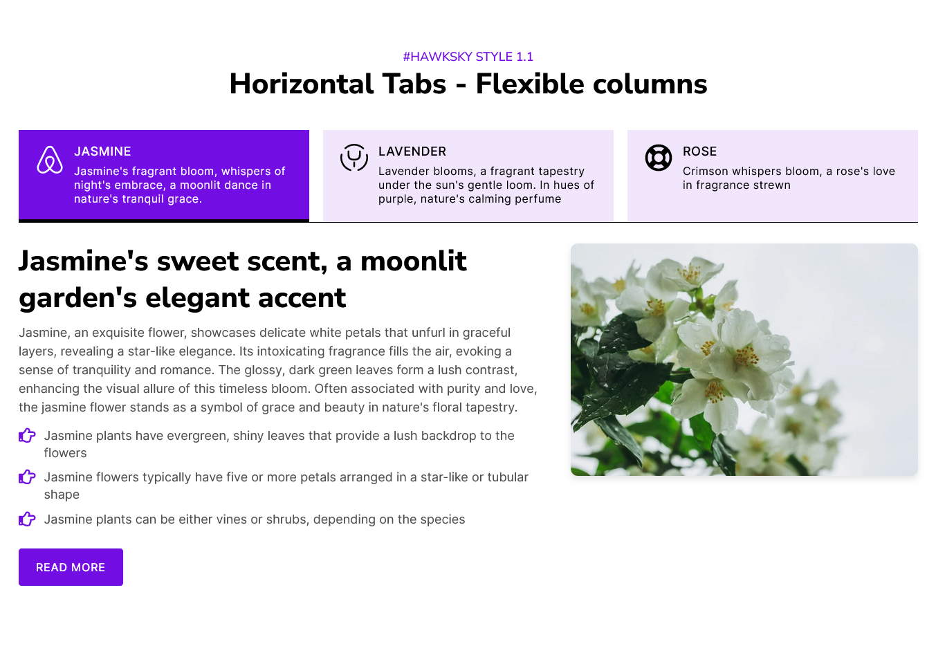
Figure 2: Vertical Tabs

Content Setting

Under “Content”, you can edit the content you want to be displayed on your Tabbed Content with Flexible Columns section. Easily adjust and update the “Section layout”, "Enable heading", "Enable animation", "Tabbing style (Horizontal and Vertical Tabs)", "Tabs items (This is the repeater group. You can do unlimited tabs added.)", "Tabs Icon Position", "Enable tabs description", "Tabs columns layout", "Tabs content flexible column width", "Grid spacing", "Tabs icons (Default and Custom)" and more as you please.
Below is an overview listing of module content settings:
- Section layout: Section layouts can be set across module levels. Such as "Container" and "Full width".
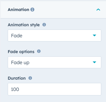
- Enable animation: Animation of heading and Tabs items can be shown/hidden using "Enable animation" field.

- Enable heading: Section heading can be display using "Enable heading" field
- Heading Group: Heading group includes heading animation, overlay text and heading text.


- Tabs animation: Animations include various styles options including such as "Fade", "Flip" and "Zoom".
- Tabbing style: You can easily manage the "Tabbing style". Such as "Horizontal" and "Vertical" tabbing style.

- Tabs items: Tabs items are a repeater group of items. You can do unlimited tabs, button added.

- Tabs icon: You can customize the tabs icons yourself. Like "Default icon" and "Custom Icon".

- Tabs button text: Tabs button text in you can easily be changed.
- Columns layout: Supports 1 to 12 column grids. Which you can do according to your specific requirements and design preferences
- Tabs content heading: You can also add the main heading text of the column.
- Column[1 to 12]:
- Column elements: Columns elements such as "Heading", "List", "Repeater Button", "Video", "Feature Image" and "Footer Text". You can set the elements in order yourself. Ensure that the module can handle different content formats gracefully. Adjust the elements according to your specific requirements and design preferences.
- Heading text: Specific column heading text. You can easily be changed.
- List: List is repeater group. You can also use unique icons for list items.


- Button: Button is repeater group. You can also use button such as "Filled Button", "Bordered Button" and "Text Button".


- Feature image: Feature image is an element of the block column.
- Video: Video is an element of the block column. Video type such as (YouTube, Vimeo and Video file). You can present the content better.

- Footer text: Footer text is an element of the block column. You can use footer text to present extra notes.
- Inline element style setting: You can use inline element style settings to better present column elements. Like "Alignment (Left, Right and Center)", "Icon size" and so on.
- Flexible column setting: Using this you can customize the column width for "Desktop", "Tablet" and "Mobile".
- Grid spacing setting: Using this you can customize the column gap for "Desktop", "Tablet" and "Mobile".
- Tabs icon: You can customize the tabs icons yourself. Like "Default icon" and "Custom Icon".
- Tabs advanced setting:
- Enable tabs button icon: Using this field, you can show/hide the tabs button icon.
- Tabs icon position: Using this field, you can customize the tabs button icon position such as "TOP", "LEFT" and "RIGHT".
- Enable tabs button description: Using this field, you can show/hide tabs button description.
- Enable full width tabs button: Using this field, you can customize the tabs button horizontal, set the full width.
- Show/hide URL param: Using this field, you can show/hide tab ID parameter after URL.

- Module JS: Include the module level jQuery show/hide field.
Style Setting

- Section: Under section spacing and background to manage module background solid color, background gradient and background image with overlay solid color and gradient. And spacing to easily manage desktop, tablet and mobile padding.
- Heading: Easy customize the overline text typography font, color, line height, text transform and font weight and Heading alignment and spacing.
- Tabs button row: This group includes the tabs button row custom style. You can customize the such as "Alignment", "Background color", "Border", "Spacing" and "Border radius".
- Tabs button:
- Tabs text font: Using this field, you can do easily customize the tabs button text such as "Font size", "Color" and "Font weight".
- Text Transform: Using this field, you can do easily customize the tabs button text such as "Uppercase", "Lowercase" and "Capitalize".
- Letter spacing: Using this field, you can do easily customize the tabs button text letter spacing.
- Tabs description: Under this group includes the "Description font", "Description font color", "Description line height", "Description font weight", "Description text transform" and so on.

- Tabs icon: Under this group includes the such as "Tabs icon width", "Tabs icon height" and "Tabs icon color".
- Background: Using this group, you can easily customize the tabs button background style. Such as "Solid" and "Gradient".

- Alignment: Using this field, you can easily manage the tabs button text alignment. Such as "Left", "Right" and "Center".
- Tabs button - Border: Using this group, you can easily customize the tabs button border such as "TOP", "RIGHT", "BOTTOM" and "LEFT".

- Border radius: Using this group, you can easily customize the tabs button border radius such as corner "Top left", "Top right", "Bottom right" and "Bottom left".

- Spacing: Using this group, you can easily manage the tabs button spacing such as "Desktop", "Tablet" and "Mobile"
- Button GAP: Using this group, you can easily tab button between gap manage the "Desktop", "Tablet" and "Mobile".

- Hover - Tabs button: Using this group, you can easily customize the hover on tabs button "Text color", "Background solid color", "Background gradient color", "Border color" and so on.
- Active - Tabs button: Using this group, you can easily customize the active on tabs button "Text color", "Background solid color", "Background gradient color", "Border color" and so on.
- Columns elements: Under this group includes, all the columns element custom style such as "Margin button (Desktop, Tablet and Mobile)", "Video icon color", "Video Popup background color", "Image box shadow", "Image border radius" and so on.
- Tabs content: Under this group includes, tabs content block custom style such as "Spacing (Desktop, Tablet and Mobile)", "Background (Solid and Gradient)", "Border", "Border radius" and so on.

- Container custom size: Container width to customize the custom container width.
Support
If you have further questions, please reach out to our team at hawksky3012@gmail.com.